DataVis – Summary (ICAM130) (Reflection)
ICAM130 Data Visualization Series: This is the introductory post to a series of visualizations created during Data-Vis courses and independent research at UCSD.
Data Visualisation at UCSD, taught by Lev Manovich, was one of the funner courses I’ve experienced.
The data visualised were unique in that it centred around visual assets; images, rather than numbers or words. This was great for melding skills in data processing and analysis, and a desire to improve in visual design - faciliated by an atmosphere of talented mentors and colleagues.
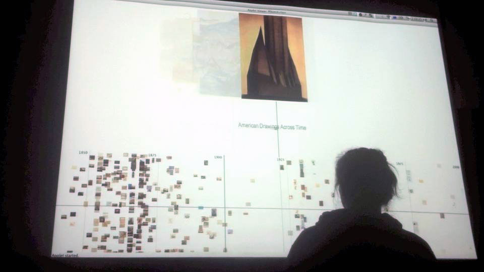
Such visual explorations included:
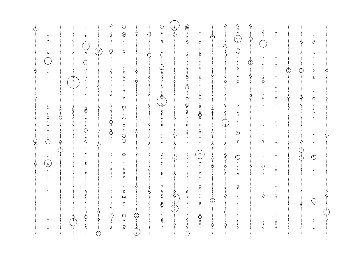
Some early test comic-book-art data that was mined and visualised.
.jpg)
And for the main project of ICAM130 (and bit of an independent study):
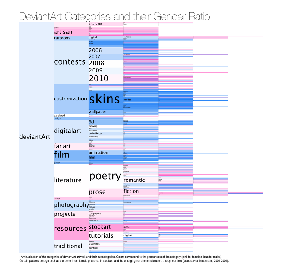
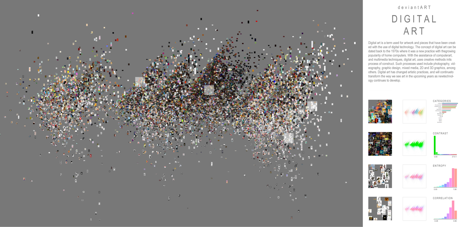
The Deviant Art studies were presented at ‘Best of ICAM’.
Overall the course was very well taught, with supportive and skilled mentors and colleagues. I learnt a lot in regards to the union between data manipulation, information synthesis, and aesthetic visualization - the art of data visualization.