DataVis – Exploring DeviantArt Categories (Report)
ICAM130 Data Visualization Series: This is a series of visualizations created during related courses and independent research at UCSD.
Exploring DeviantArt Series: A series of visualisations exploring art, an expression of human creative skill and imagination in varying mediums, through the lens of the online deviantArt community.
This is a report on the findings made from exploring the categories of deviantArt.
EXPLORING DEVIANTART CATEGORIES
by Hanley Weng
INTRODUCTION
Art is the expression of human creative skill and imagination. It incorporates many traditional creative practices, such as painting, literature, sculpting, and many more recent digital forms from 3d artworks to film and pixel art. The web has allowed artists an even greater domain to express themselves to a larger audience. Not only that, the web connects artists amongst their peers and viewers, and carries with it memes and cultural influences that effect, and are affected by, artists.
DeviantArt, or dA as it is known by its online community of 19 million artists, was first launched in 2000, and has since grown to be the 13th largest social network (as of July 2011). It receives over 100,000 daily uploads of original artworks, spanning it’s vast tree of categories and subcategories (over 1700), from stock art of aquatic animals, to silkscreen printing, and comedic films.
Our core dataset was provided by Lev Manovich’s Software Studies lab, it consists of a sampling of deviantArt artworks and their associated metadata (such as an artist’s artwork, date of publication, title, etc.).
Artworks are organized in a hierarchical tree structure of categories, represented in the form: “/Stock Art/Animals/Aquatic”. With this dataset, we can filter, explore, and perform algorithms on this multi-layered data in order to generate visualisations that can reveal cultural patterns.
PROCESS
In the path to a visualisation of the categorical structure of deviantArt, many iterations were progressed through. The visualisation developed from the exploration of the most suitable parameters (age, population, gender, etc.), to the improvement of aesthetics, and the discovery of narratives. What follows is a series of iterative designs that were undertaken during this process with descriptions and critiques.
![]()
Figure 1. An early, nested representation of the hierarchical structure of deviantArt traditional sub-categories. The ratio of female to male is mapped by hue over the entire colour spectrum, whilst age is mapped using brightness. This mapping results in complex mental models of the data as two complex keys are overlayed over one another. In order to achieve this visualisation, deviantArt data was parsed, and individual artworks placed in a generated tree-based data structure depending on their stated categories. A nested structure was chosen, as the initial attempt at a circular structure revealed that leaf nodes were imperceptible at A4 size.
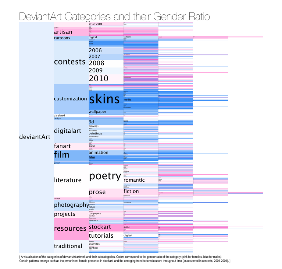
Figure 2. The nested representation (figure 1) of the structure was replaced with a clearer, horizontal expansion of subcategories. This allowed for a much wider representation of all categories of deviantArt. Female to male ratios are now colored as pink and blue correspondingly. Though the equal column widths maintains balance in the graph, it loses readability as subcategories reach deeper states. Also, this graph simply plots categories in an alphabetical manner - a sorting that is not reflective of the parameter (male-to-female-ratio) being depicted.
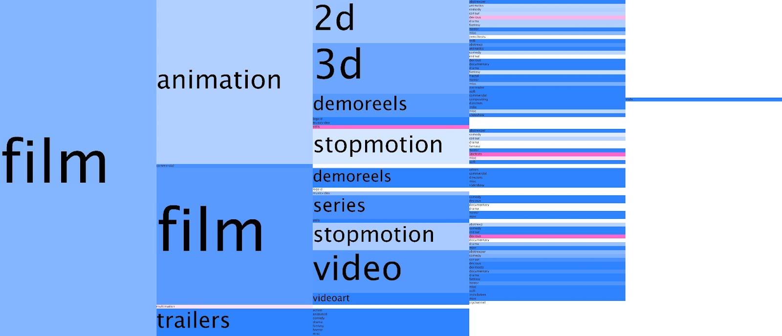
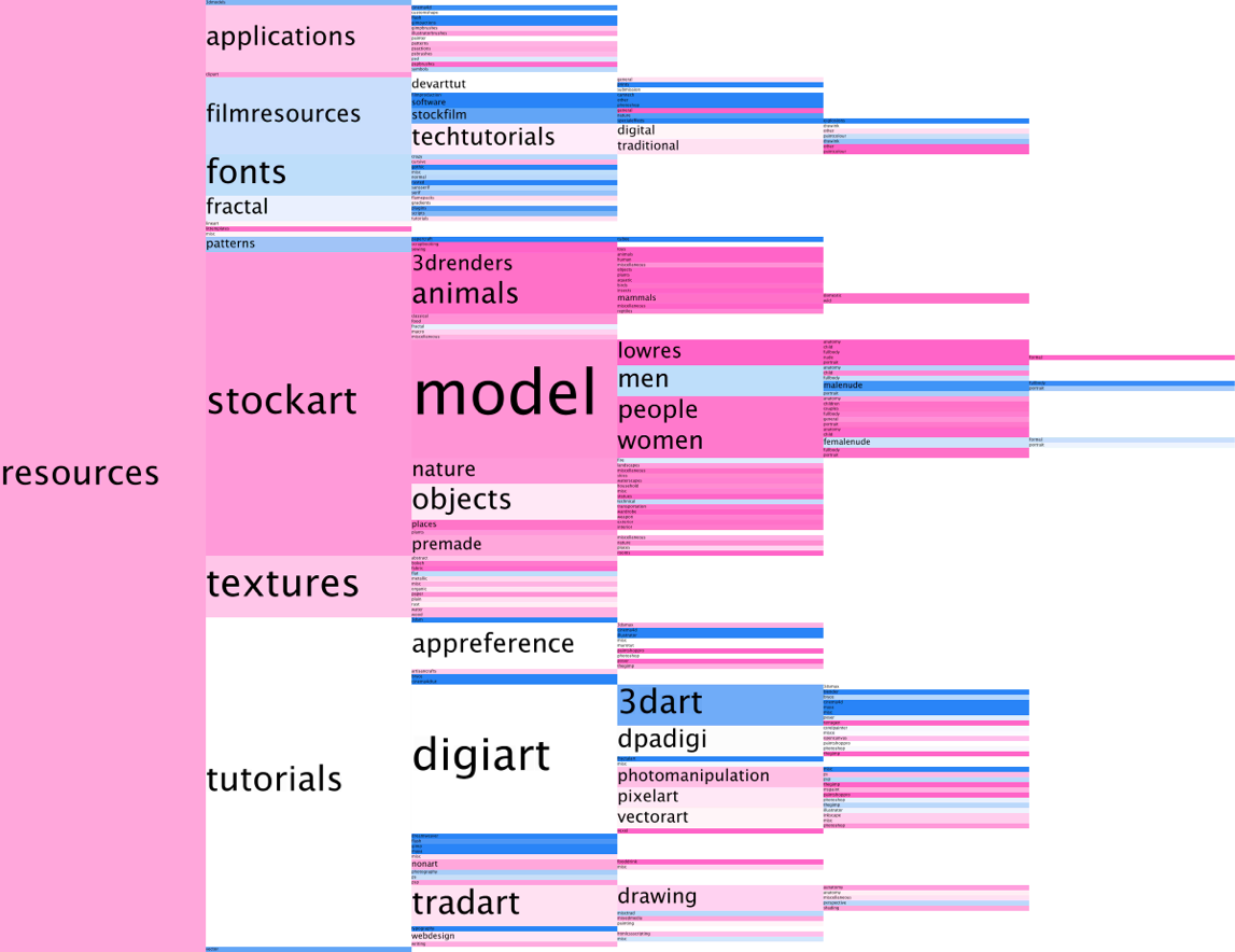
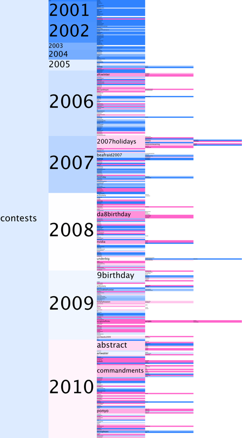
Figure 2.a.b.c. Regardless of the issues with figure 2, zooming in onto such categories as film (a), resources (b), and contests (c ), reveals some overall trends. Film and Resources are the polar opposites in terms of the genders of their contributing artists. Contests reveals the expansion of subcategories throughout time, and the transition from a heavily dominated social network to a more female-dominated one.
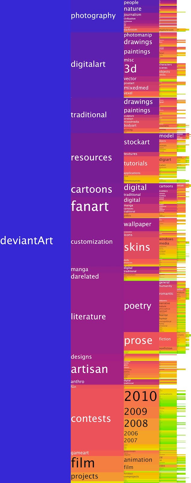
Figure 3. An exploratory visualisation of logarithmic population over a hue spectrum.
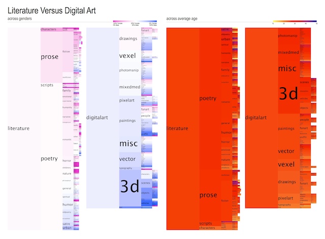
Figure 4. A comparison of literature and digital art categories across the parametres of gender (left) and age (right). In comparing different parameters such as gender, age, and population (depicted in figure 3), it is found that gender tends to tell the most interesting stories, hold the greatest variance and outliers, in this visualisation of categories. Hence, gender is chosen as the core parameter for subsequent categorical visualisations.
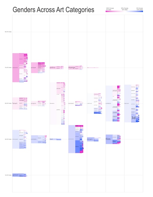
Figure 5. In an attempt to better visualise the categories of deviantArt, they were split into their top-level categories in this visualisation. A bar-chart is formed by grouping top-categories of similar female-to-male ratio and stacking them next to one another. This visualisation however requires an uncomfortable amount of zooming to grasp it.
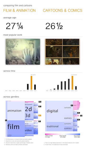
Figure 6. Following minimalistic inspiration from visualisation designers such as Nicholas Felton and Lev Manovich’s primer on visual design, a gridded structure was undertaken to compare two specific categories with the goal of formulating a comparative narrative. In this graphic however, there are some conflicting colour schemes, and unclear and irrelevant information (e.g. average age across both categories have insignificant differences). Most importantly, the graphic holding the most potential information is diminished to the bottom of the visualisation.
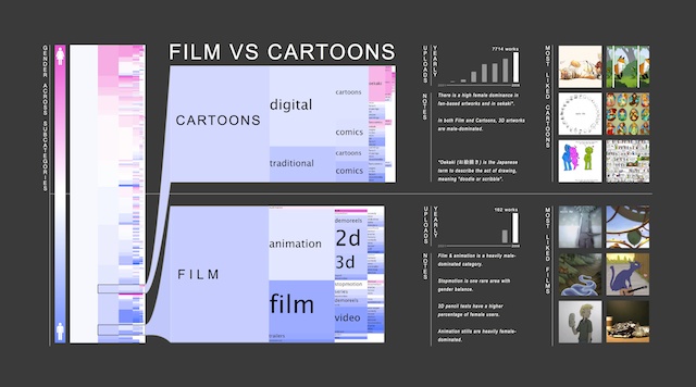
Figure 7. A more aesthetically finalised visualisation depicting the
difference in subcategories between film and cartoons. Categories are
colored by the female-male-ratio indicated to the left of the graph. The
location of these two categories in the entire deviantArt tree is indicated
on the left key. Column charts are used to represent the rate of uploads to
each category, followed by observed notes, and icons of the most popular
artworks within these categories throughout time.
Throughout this design process, much inspiration was taken from other artists and teachings. Small algorithmic improvements were also made to improve the visual accuracy of the information. Throughout the process, the concept of narrative was developed as small findings were noticed throughout the visualisations.
DEVIANTART CATEGORIES
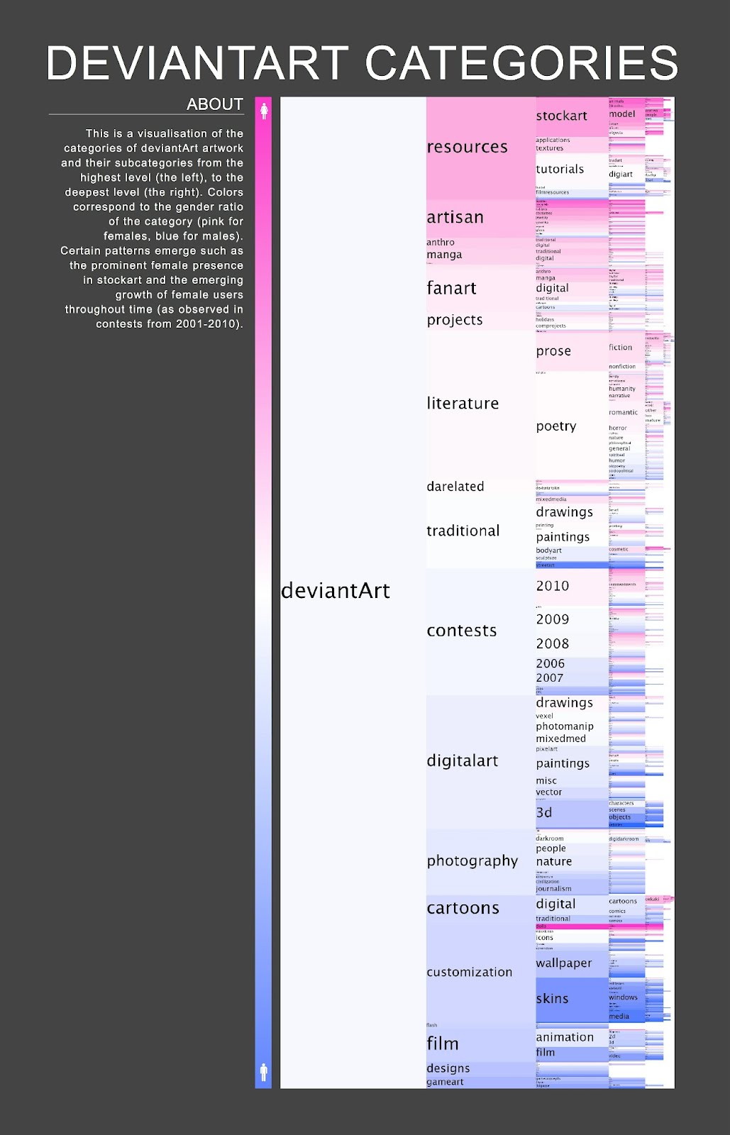
Figure 8. A visual representation of the hierarchical structure of the categories of deviantArt. Children categories are horizontally nested to the left of their parent categories. Each category is colour-coded to their female-to-male ratio of uploaders (more pink symbolises a heavily female dominated category and vice versa, as indicated by the vertical key on the left of the visualisation). Children categories are sorted from highest female-ratio to the least.
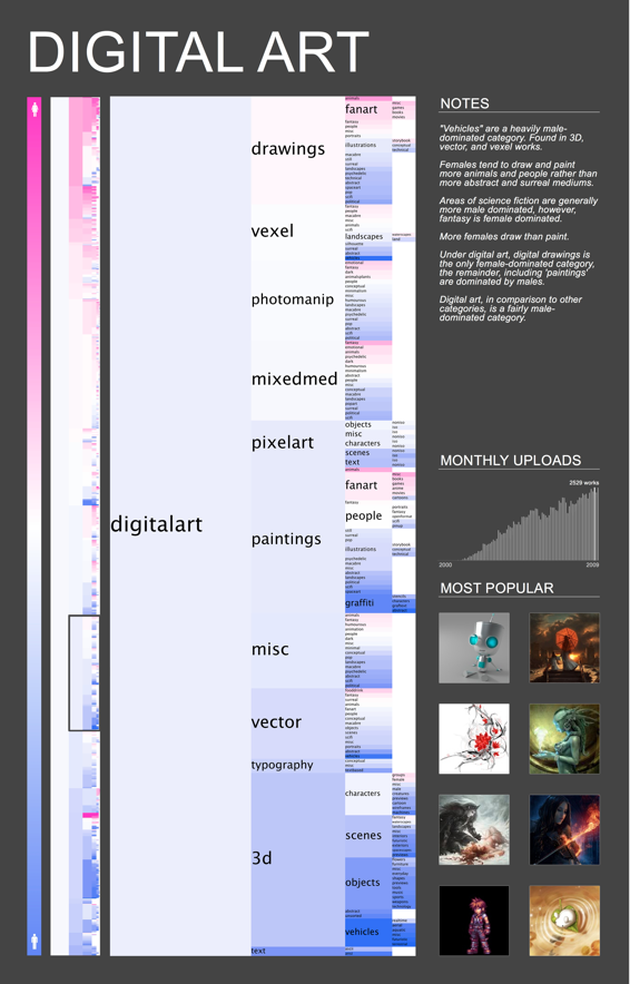
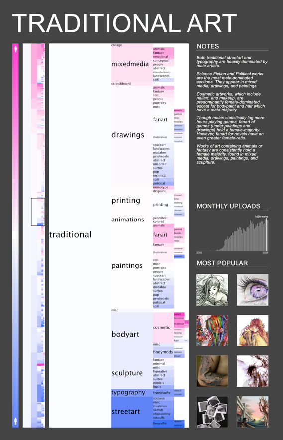
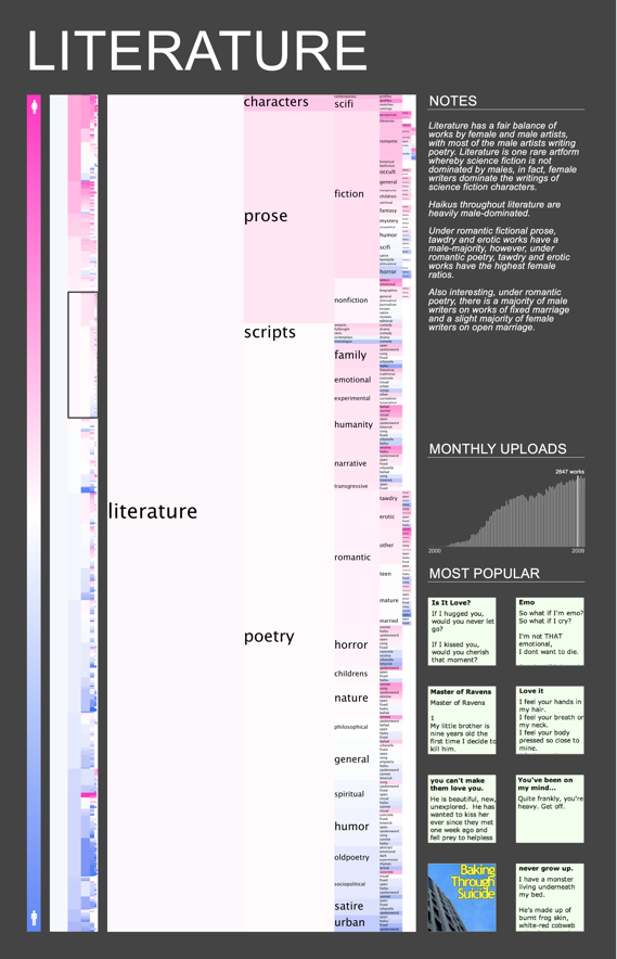
Figure 9. a. b. c. Visualisations were generated of certain subcategories; a. Digital Art, b. Traditional Art, c. Literature. These categories were chosen as they reveal much information in their comparison. Similar to their parent; Figure 8, a female-to-male-ratio key is indicated to the left. Figure 8 is also added, with the zoomed area outlined, followed by the visualisation of the category (and subsequent categories) itself. To the right, there are observed notes of the graphic. This is followed to the bottom by a histogram of monthly uploads, and then by an aesthetic icon representation of the most popular artworks of the categories.
The finalised visualisations of deviantArt categories are depicted and described above in figures 8 and 9. Specific categories were chosen for extended visualisation as they told interesting narratives.
To name a few findings; figure 9a & 9b reveal a male dominance in vehicle, abstract, surreal and science-fiction works. A higher female dominance is also observed in drawings than in paintings. Though the high female dominance in mixed media, drawings, paintings and sculpture is expected in Traditional Art (figure 9b) game art has a surprisingly large number of female contributors. The non-visual medium of literature, depicted in figure 9c, can also reveal interesting information, such as the observation that under romantic fictional prose, tawdry and erotic works hold a male-majority, whilst under romantic poetry, tawdry and erotic works have the highest female ratios.
These zoomable visualisations can be explored - facilitating the discovery of trends and patterns across different types of artworks and categories.
FUTURE WORK & CONCLUSIONS
Though a visualisation of the categorical structure of deviantArt allows us to understand this complex network a fair bit better, it addresses only a fraction of the potential of this data. There are many different ways of exploring many different subsets and aggregations of such data.
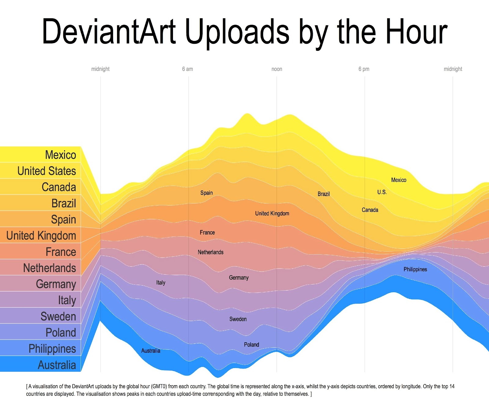
Figure 10. A visualisation of the DeviantArt uploads by the global hour (GMT 0) from the countries with most deviantArt artists.
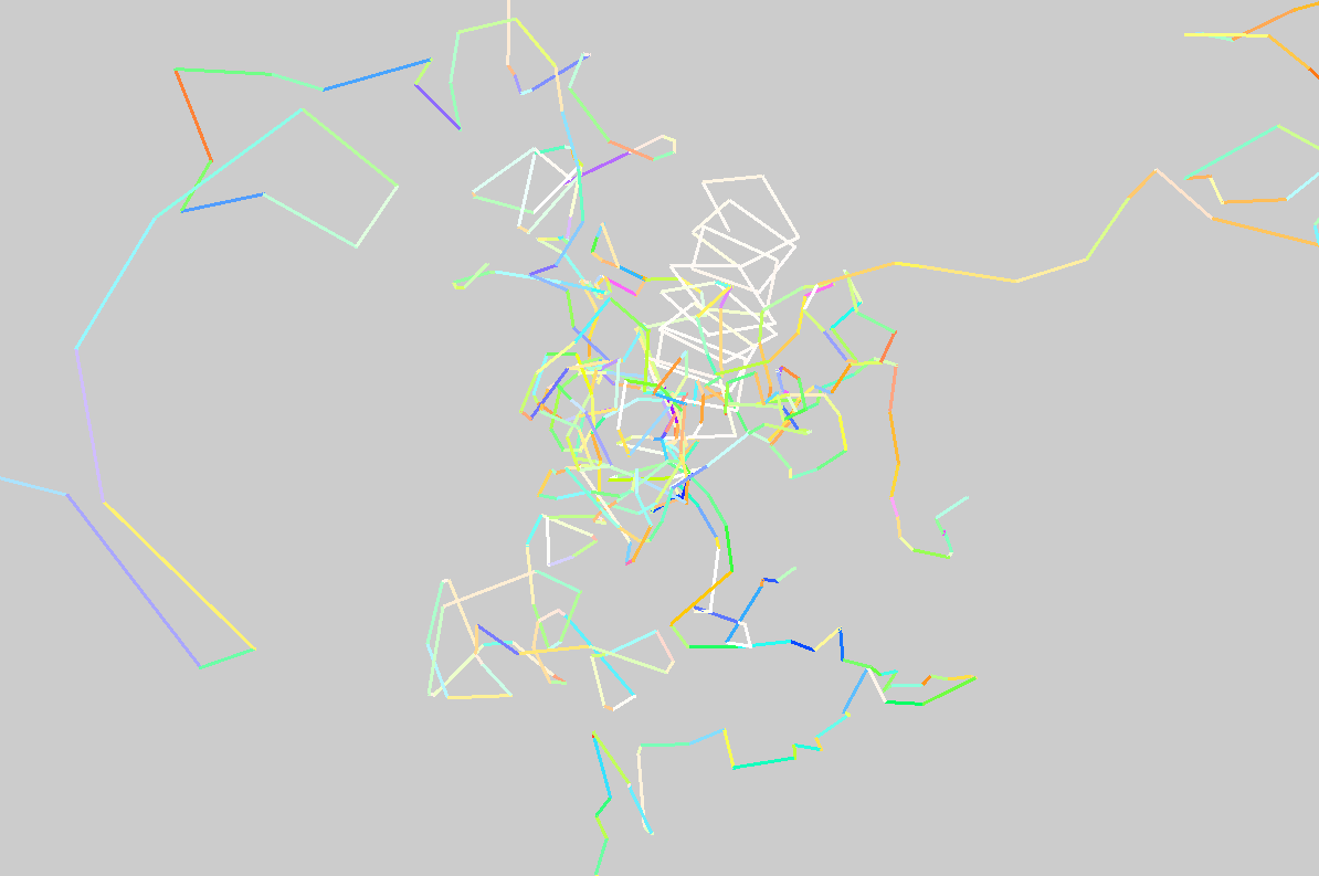
Figure 11. A visualisation of the paths
of the ten most heavy deviantArt uploaders. The progression of a point
along an artist’s path is dependent on the difference in their
artworks.
- done in collaboration with Bradley Schnell.
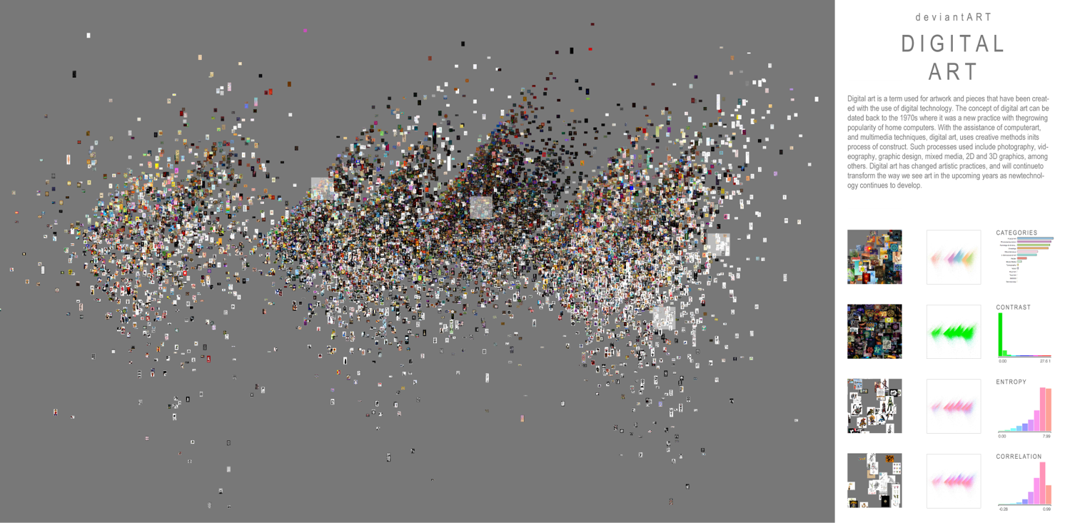
Figure 12. An image plot of traditional
artworks, clustered predominantly by their top-level categories, followed
by various image-features such as entropy.
- done in collaboration with Teenah Eco.
From geolocated uploads (figure 10), to the abstracted behavior of individual artists (figure 11), to the clustering of similar artworks (figure 12), much knowledge can be gained from this dataset. Upon the acquisition of more findings, these processes can lead to the creation of books, and predictive findings of future memes - derived from the analysis of past trends.
The deviantArt dataset holds much potential. It is reflective of cultures and demographics from niche cliques to global phenomenons. As peaked at in this visualisation and its’ process, visual exploration of this data can allow for temporal, cultural and demographic revelations.