Visualizing Temporal Networks (Summary Academic Writeup)

Summary
This is a summary writeup of the project “Visualizing Temporal Networks” in regards too:
- Design and Implementation of Techniques
- Case Study with an Email Network
The full process sketchbook with pictures and videos can be found under: “Visualizing Temporal Networks (Detailed Process Sketchbook)”.
Design and Implementation of Techniques
This project’s intent was to create renders of temporal networks.
Overall Process
Overall, the process of this project ran through these rough steps:
- The blueprinting / drafting of animations
- An exploration of technoilogies for the render; looking into Unity, 3D, and other Graph programs before deciding on Gephi and Processing.
- The search for temporal expansive scale-free network data using generative, scraping, and mining methodologies.
- The generation and improvement of a rendering system to visualise such networks.
- The choosing of three core data sets: a custom 10-node case scenario, a biological dataset, and a personal email network.
- The refinement of the rendering system with the chosen data sets.
Data
A visualisation can not be created without data. For our visualisations, a search was undertaken for temporal scale-free network data that were sufficiently large (above 100 nodes).
Early attempts involved the generation of such a network with the Barabasi-Albert model. However, such artificial generation of a temporal network didn’t appear organic enough, as it lacked desired metrics that could be expected from real world networks such as higher k-core values.
Mining for realworld data was undertaken as an alternative to the artificial approach above. The search involved data from conferences, academia, machine learning, cultural brands, Twitter, New South Wales and Australian Statistics, and various movie databases* – searching for network data that was expansive, temporal, and potentially scale-free. Of the datasets explored, Movie data appeared to fit the criteria best, with IMDB lists being the most flexible.
In the end, the following three data sets were selected:
- A custom-made 10-node temporal network useful for demonstrating visual effects.
- A biological dataset from NCBI.*
- A personal email network.
Visual Treatment
Progression
In the early stages of visual development, blueprints and animation drafts were quickly created to convey the type of effects and speed desired. These early drafts were created with animation and video software; Adobe Flash and Adobe After Effects.
In creating a rendering system that could actually generate a visualisation, a few different software packages were explored. Unity (with C#) was considered when the visualisation was possibly in 3 dimensions, however Unity didn’t result in the smoothest of interactions for networks. In future, interactive 3d alternatives such as Cinder or openFrameworks should be considered. Houdini was also considered - however that would shut the door on the potential for an interactive system. The selected package: the Processing library for Java, was a viable option for 2 dimensional visualisations (though it is capable of 3D), and it worked well with the Gephi Toolkit.
A variety of network programs were explored before deciding to use Gephi for network calculations. The reason Gephi was selected was due to its relative modernity, documentation, more refined handling of temporal data, its java toolkit, plugins, and its user friendly GUI component.*
As different data sets were introduced, the custom rendering system added new features and improved on existing ones.
Features
Visual features are ammended to the temporal network and its elements.
Elements can be nodes, edges, or groups of nodes and edges.
The following features are combined under different parametres for different datasets to produce different understandings of the data.
Metrics and Visual Attributes are predominantly node-focused.
Layout
There are many different types of layouts networks could be represented with. Two-dimensional layouts were consistently favoured over three-dimensional layouts due to their smaller cognitive footprint. It was the minimisation of cognitive load that also lead to the use of static layouts above dynamic network layouts (layouts where the positions of elements can change over time).
Particular layouts included: Sugiyama, Frutcherman-Reingold, Force Atlas, Yifan Hu, Radial Axis, Circular, Multi-Circular layouts. Layouts were generated using existing graph programs Gephi or VisLab.
The rendering system was embedded with graphical user interface (GUI) elements such as timelines and control toggles to allow for rapid switching between different visualisations of a network. However, even with this functionality, it was found that comparisons were made more easily between visualisations when they were layed out next to one another in the form of collages.
Visual Attributes (of elements)
The elements of a network can be imbued with a variety of visual attributes. In the rendering system, nodes often contained the dominant visual attributes, often determining the visual attributes of the remaining elements. Visual attributes include an element’s colour, size, halos (or hulls / outlines / ghosts of a single or group of nodes), and additional attributes in the form of nearby text labels or symbols.
A Node’s colour is usually pulled from a colour palette which maps to a particular metric of the node. An edge’s colour is a gradient determined by the colours of its nodes.
Halos around a node or group of nodes and edges can vary their visual emphasis depending on the associated metric.
Text labels are often tied to nodes and, when enabled, can have a size relative to that of the node or a constant size. Like the other visual attributes, its use is determined by the network and its purpose. For example; certain networks where the focus is greater on the structure itself rather than specific content would benefit from no labels. If the analysed metric has only a few top values than the labels at relative sizes can be informative.
Other symbols such as crosses, rings, and arrows can serve to highlight a particular node or represent a node’s metric.
Metrics (of elements)
A graphs’ elements have a variety of metrics: these include measures of centrality (indicators that identify a nodes’ importance) and structure.
The system computes the centrality measures; Degree and Betweenness. In terms of structural metrics, we also compute KShell and Dynamic Modularity (also known as communities or clusters).
KShell is computed as the maximum level of k-degenerate graph a node belongs too. *
Modularity was initially visualised as a global (hence static) metric. To calculate dynamic modularity, static modularity was computed via the Gephi Toolkit for every time window of the network. Matching, similar, and dissimilar modules were then computed with Jarcadian distances between neighboring timewindows, represented as evolving vectors, normalized as angles, which were mapped as colors. *
All of the above metrics are dynamic throughout the temporal network. These metrics, as well as the rate of change of these metrics, are selected for mapping to the visual attributes of the rendered network.
Mapping
Visual attributes are mapped to metrics or the change in a metric. For example; a visualisation may map nodes’ colors to the rate of change in Betweenness Centrality, whilst mapping their size to KShell. One metric can be mapped to more than one visual attribute. Not all metrics are always displayed simultaneously. The variations of mappings leads to different understandings of the network with varying effectiveness.
Timeline
Temporal networks consist of dynamic nodes and edges. These dynamic elements can be introduced and removed from the network at any point in time. The addition and deletion of these elements effect the metrics of other elements within the network. Temporal networks can be viewed as a series of static snapshots (timewindows) of the network. These snapshots are not representations of the network at a singular point intime, but rather a certain time window from one point in time to another. This is similar to photography where an exposure time is required to capture a sufficient amount of information.
The sequence of snapshots (or timewindows) taken of these networks have a start point, end point, and a duration (which is the time from end to start point). There is a duration gap between each snapshot, often of a consistent duration - this means that snapshots may or may not overlap with one another. The chosen duration of, and duration between, each snapshots is dependent on the chosen data and purpose of visualisation.
The rendering system deals with different types of nested timelines. From parent to child, these are the: inter-snapshot, intra-snapshot, propagation timeline.
The inter-snapshot timeline is the overall timeline of the entire network from beginning to end. It consists of all snapshots taken of the network. The duration between each snapshot is often kept constant, however, temporal networks with sparse events can have their data compressed so there are no snapshots in which no element has changed. This warping of the timeline is done by looking at each unique timestamp of the network’s elements and remapping it into sequential integers (e.g. 1,2,3,…), playback would then occur at 0.5 increments (e.g. 1.0, 1.5, 2.0, …) with a duration of 1.0 .
The intra-snapshot timeline exists between two adjacent snapshots and determines what visuals occurs as one snapshot transitions to the next. This timeline is often set with a 10-20% buffer period at both ends of the timeline, giving users time to observe a static view of the snapshot before any animations occur. Discint bugger periods could be set for nodes and edges, however, it appeared that the animation was easier to comprehend when both were set to the same periods. A few visual effects can be tied to this timeline; such as the fading in and out of rings around nodes that denote a change in metric value, or the fading in and out of edge halos that represent their addition or deletion. Most effects however are more appropriately applied to the propagation timeline.
Changes in metrics can propagate throughout a network, beginning with the addition or deletion of an element. The ordering of elements in this propagation can be represented as the number of hops they are from the change. For example, consider the propagation of the betweenness centrality metric if an edge is added between two significant clusters of nodes, the edge and its adjacent nodes would be the first to be updated, having a hop-level and order of 0, the unclassified nodes adjacent to these would be next, having a hop-level and order of 1 from the event, and so on. Elements that undergo minimal change do not carry on the process.
This propagation of change in the network can be visually represented through the use of animated thick edges that gradually extend from the point of change to other elements affected by the initial structural change in the network.
The propagation timeline denotes the order in which nodes and their edges are animated through their changes between snapshots. This order often follows the propagation order of events, however, other orderings have been used. An alternative ordering is elements being ordered depending on their layout, with top elements ordered first - this is especially useful with the Sugiyama layout where parent nodes are placed higher up, resulting in an animation that can insinuate a parent-to-child significance in metric changes. There can also be no ordering at all, where all elements are animated simultaneously. The number of distinct orders in this timeline can also be used to denote the duration of the parent timeline; the intra-snapshot timeline - meaning events with more changes can be observed longer. The rendering system can also artificially cap the maximum number of orders rendered independently, choosing to collate the remaining orders together. With the datasets explored, it appears that 50% of the maximum distinct order is a good cap - allowing for the representation of propagation, and cutting out many sparse propagations as it is rare for propagations to reach their maximum.
Within the propagation timeline, core visual transitions occur such as the change in a node’s color and sizes. Significant elements may be additionally highlighted with symbols to emphasize them or certain metrics they possess.
Similar to its parent, the propagation timeline also utilises a small buffer period between animating different orders of elements.
The timing of visual effects, whether within the intra-snapshot timeline or the propagation timeline, appeared to incur less cognitive load when they are slower and discrete from one another.
Rendering System
The rendering system is a workflow to create renders of temporal networks. It consists of three stages: data manipulation, metric calculation, and visual rendering.
Data is manipulated and cleaned into a temporal network in the form of a GEXF (Graph Exchange XML Format) file. Data is often collated, cleaned, and transformed into this format using spreadsheets and custom programs to parse and rearrange the data. Any labelling of the data is also done at this stage along with the generation of different visual layouts for the network represented as different files. Likewise, any global (static) metrics are calculated at this stage. The optional warping of a networks timeline to reduce non-events between snapshots is also done during this stage.
Dynamic metrics are then calculated upon a single gexf network file. This is done using the Gephi Java Toolkit 0.8.5. Once snapshot duration, gap, and overall timeframe are chosen, metrics are calculated for each snapshot. Centrality metrics such as Degree and Betweenness can be directly calculated using the toolkit. KShell is calculated as the maximum K-Core value of a node via the toolkit. Dynamic Modularity is custom calculated with the help of the toolkit’s static modularity calculation. These dynamic metrics are then compressed and written to a new version of the gexf network file.
The program responsible for visually rendering the gexf network file is written in java, with the aid of the Processing framework and the Gephi Toolkit. It offers a range of visual parameters for rendering the network. Snapshot durations must be set to match that used for the calculation of dynamic metrics.
The program features the ability to instaneously toggle between different variables. Absolute and relative metrics can be selected for mapping to different visual attributes. The display and style of text labels can be toggled. The colour palette can also be toggled, which can be quite significant depending on the data and metric for colour mapping. Highlights can be toggled that emphasize significant network elements: these include coloured rings around nodes corresponding to their change in value, crosses that bring the eye towards significant nodes, rising or falling triangles accompanied with text emphasising the relative or absolute change of a chosen metric, and thick transitional lines that denote edges between significant nodes.
To allow for browsing and fine-tuning of the network and program, GUI functions were added including zooming, panning, and browsing of the timeline.
The program outputs the temporal network as a series of images. These are then compiled with After Effects, and can accompany other series of images to offer an animated collage comparing different renders of networks.
This rendering system allows for the creation of a multitude of different outputs that can highlight a variety of important factors in a temporal network.
Case Study: Email Network
The Dataset
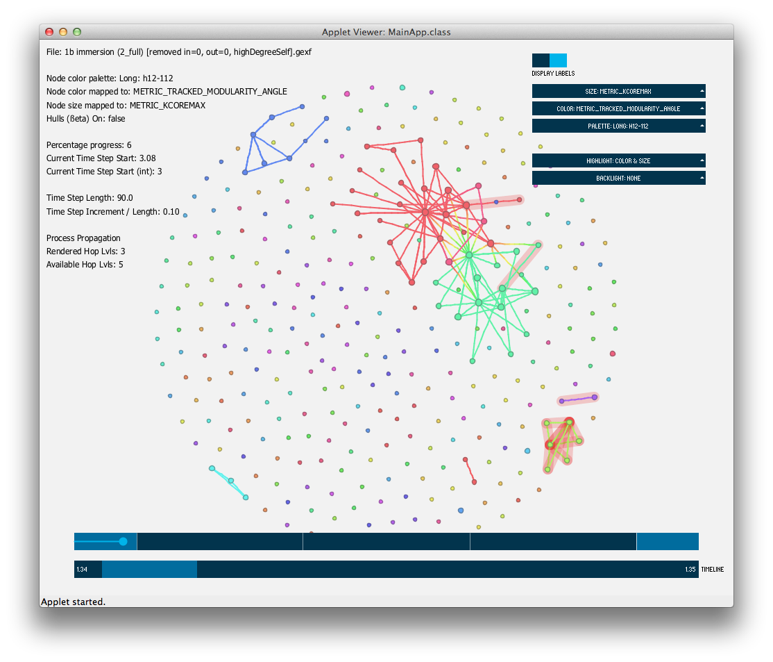
As a case study of the limitations and benefits of the rendering system above we can look at its applications with an email network.
This email network is derived from the personal email data of a single user. This dataset contained the subject, timestamp, from, to, and cc fields of an email. A temporal network was formed with all emails, whereby each email is represented as a ‘star’ in time between a single sender and (potentially) multiple receivers. Therefore each person is a node, and a temporal directed edge is formed between a sender and receiver. The network was filtered for meaningful connections, people whom there had been a significant amount of emails to and from the user.
The first email at this address, and hence the data, was May 2008 and is still in use as of the date of mining in June 2014. This dataset includes approximately 43,000 emails. Though data was available for six years, only small subsets of the dataset were focused on at any one time usually ranging from 8 to 24 months. For reference, a snapshot of 24 months filtered for meaningful connections resulted in approximately 300 nodes (people), 1500 unique global (static, with no disregard to time) connections (edges) between people, and 5400 unique temporal connections between people.
Snapshot duration and gaps varied between renders. However, one of the more common settings was a 90 day duration with 10 day gaps between snapshots.
Versions of this network also underwent warping of the timeline in order to differentiate connections in peak times, and to reduce animation length during periods with little or no events.
Using the rendering system, the network was observed and analysed under a variety of different visual parametres with a focus on different metrics.
Communities
The significant communities within this network are outlined here.
Key: Communites:
-
Corporate
- Company AS
- Company AS.D1
-
Company AS.D2
- Company B
- Company BS
-
Company BM
-
University CC
- University DS
- University DS.L
-
University DS.T
- High School EE
The communities above are hierarchically encoded. The first letter denotes that it is a distinct entity. The second letter denotes the city of this entity (i.e. Company AS, Company BS, and University DS share the same city ). Company B is an international company with offices at S and M, Company B is also the parent company of Company AS. Any encoding after the first two letters serve to break down the hierarchical community further; Company AS is broken into departments (D1, D2) and Unviersity DS is broken down into the user’s role when these connections were made (L for learning, T for teaching). Company B and AS are collectively reffered to as the corporate community.
The majority of these communities were distinct and disgtinguishable in the overall static view of the network. Finer communities such as those within the corporate community were identified during playback of the temporal network.
To understand how this network evolved, it should be noted that the period of this temporal network covers the user’s initial collaborations with other students in University DS, the beggining of work at Company AS where a variety of departments were interacted with. Eventually Company AS and B began merging and sharing projects. Towards the end of this network’s period, the user also began teaching at University DS.
Visual Attribute Selection
Four distinct renders were made of the network and compiled into a single collage render. Observations were optimal in the case when a single render represented only one metric (rather than combining two or three metrics in the same visualisation), and when both colour and size were used to emphasize that metric. The four renders produced represented degree, betweenness, kshell, and modularity. Modularity is a discrete metric, and hence was only mapped to colour.
User scrubbing of the timeline of the final render was found to be more insightful than simple playback of the render.
Though the rendering system was capable of quickly switching the metrics and mappings representing the network, a compiled collage was much easier to grasp and compare the aspects of the network. An example of an observation that was made easier through a collage, also known as small multiples, is the state of the network at snapshot-start-time 3.0 . In the degree view, we can observe two important people in the network at University DS.L surrounded with people of medium importance, in the betweenness view we can identify a strong collaborator who was unnoticed in the degree view, meanwhile the modularity view shows that the person of highest importance (in degree and betweenness) is in a separate community (staff) to the other two people (student body).
As the temporal network was quite large, with events unevenly dispersed throughout time, the timeline was warped in order to distinguish discrete events (events that happened close to one another in time were spread further apart) and ommit periods where no events occured (events that were far apart in the timeline were brought closer together). Warping the timeline allowed human users to observe events with greater efficientcy.
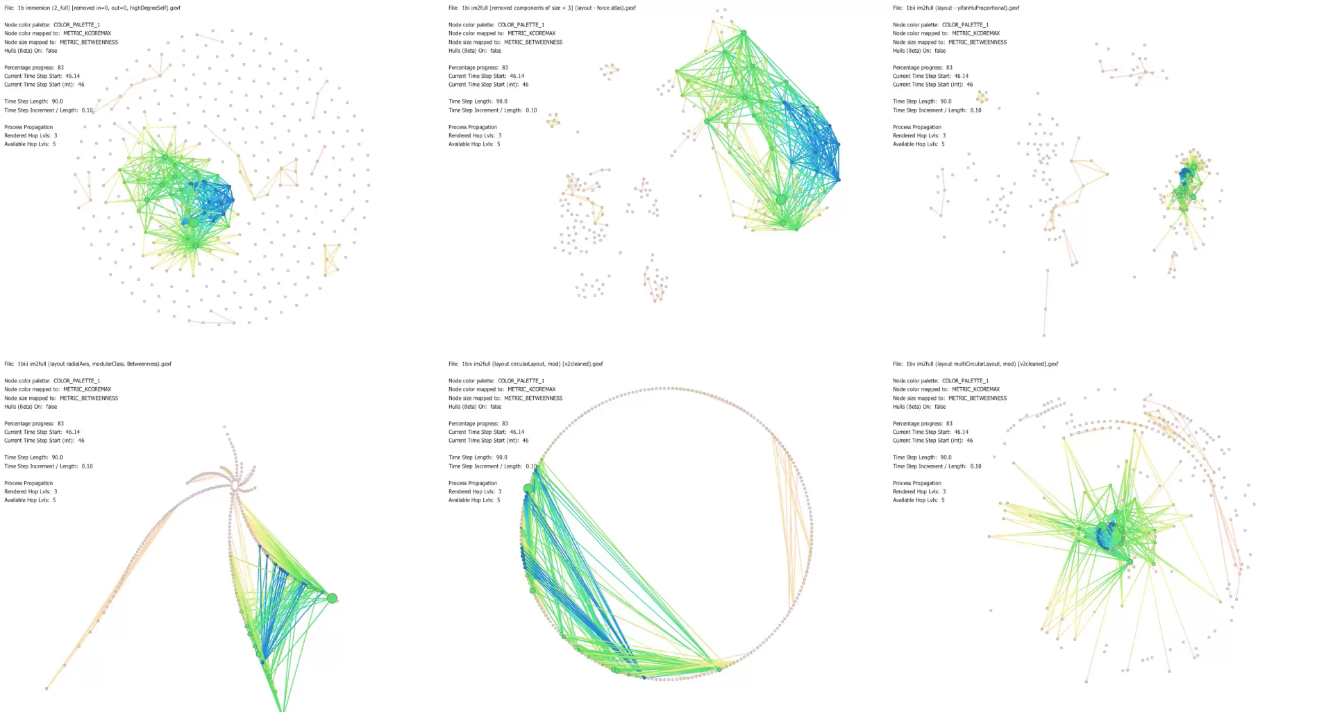
- Frutcherman-reingold
- Force Atlas
- Yifan-Hu
- Radial Axis
- Circular
- Multi-Circular
Several layouts were considered for this network. Overall, force directed methods (layout.image 1,2,3), provided the best representations of the network structure. From 1 to 2 to 3, clarity of communities increase, and consistent spacing between nodes decreases (meaning maximum-distance increases and minimum-distance decreases). It is much easier to observe between-node interactions and add visual additions such as labels to nodes when they are spaced further apart. Hence the Frutcherman-Reingold (1) layout was chosen for this dataset as it allowed freedom in the development of visual effects, room to inspect data labels, and had less edge crossings and clearer communities than that of 4, 5, or 6.
Evolution of the Corporate Network
When the user in the dataset began interacting with the corporate network, many of those interactions were through their direct supervisor in Company AS, as seen in the degree render at time 51 (where time refers to the start-time of the snapshot). Over time, this grew to the rest of the supervisor’s department AS.D1 as more people were interacted with whilst the supervisor was CCd to the communications, resulting in high betweenness (see degree and betweenness renders a time 295). Over time, additional aid was provided to another department AS.D2 which was a very tight-knit (see kshell) and distinct (see modularity) group. However, the number of distinct interactions was still smaller than AS.D1 (see degree) since AS.D2 predominantly sent large group emails (see renders at time 424). As time passed, interactions with AS.D2 became constrained to select persons within the group.
Collaborations existed between Company AS and Company B. From time 277 to time 720 we can observe communications between Company AS and BM. At time 277, Company BM contacted the supervisor of AS.D1 with a project and initial communications were begun with the leads of Company BM. During the collaborations, at time 545, we can see the full structural extent of this network, the notion it is it’s own clique (see higher kshell value), and that the supervisor of AS.D1 and one of the leads at BM have very high importance (see degree and betweenness) representing organizational structure. As the project ends and the connections disappear at time 720, we observe that it is not the higher ups who have the last inter-company communications, but the employees under them.
Over time, Company AS began interacting more with its merged parent Company B. We’ve seen previously a collaboration between AS and BM. Company AS and BS had more social interactions and bonding activities rather than work-related interactions. Around time 679, 712, we observe that BS became quite central structurally in the network (see kshell), but communications predominantly presided within existing work groups within Company AS (see degree and betweenness) also HR people who tend to have very high betweenness and degree centrality and eventually people who were leaders of group activities. It is interesting to observe a strong bridging arch being established between AS and BS composed of many Company B and some Company AS people who had low social interaction (see degree, betweenness) and were often CCd into emails (see kshell). As company activities were enacted to further join the companies together, the temporal network reveals the people most engaged with the communications - forming an even closer bridge between the two companies (see time 894, degree and betweenness). It was interesting to note that these highly engaged entities were predominantly female and international employees.
The render of this temporal network allowed the observation of evolving organizational structure, collaboration, and engagement.
Observing Propagations
The render of the email network also visualised the propagating change on metric values induced by an event such as the sending of an email. Different metrics propagate to different depths. Degree does not propagate as it is a metric local to the node. KShell can propagate, but not nearly as much as betweenness and modularity where events can effect nodes up to three or four hops away on average in this network.
Propagation through a dense subgraph such as the corporate network can be visually inconclusive as it usually reaches every node and only shows that the corporate network is highly connected regardless of its subdivisions.
Propagation has been able to reach nodes that are in distinct communities, connecting nodes that have never talked with one another - this is especially evident when a connection is made temporarily between University DS and Company AS.D2 at time 717. This level of propagation is only picked up by the betweenness metric which is more sensitive than the others.
In smaller networks, propagation can have clearer effects. At time 930, 950, 985, in University DS.T, we can observe a cluster of staff planning teaching material which is later introduced to students. We can also observe a hierarchical propagation at precisely time 941.5 and 950.5 where students ask questions and the betweenness value it propagates elevates up the hierarchical chain of academics even though they were not part of the original email.
Considering the other effects in the network, propagation does not provide as much insight into the network as the other visual attributes, however it may be appropriate in particular instances such as small temporal networks with clearly defined communities and a few important bridges.
Other Primary Case Studies
Small Case Dataset
NCBI Dataset
The full process sketchbook is more visual, and can be found under: “Visualizing Temporal Networks (Detailed Process Sketchbook)”.