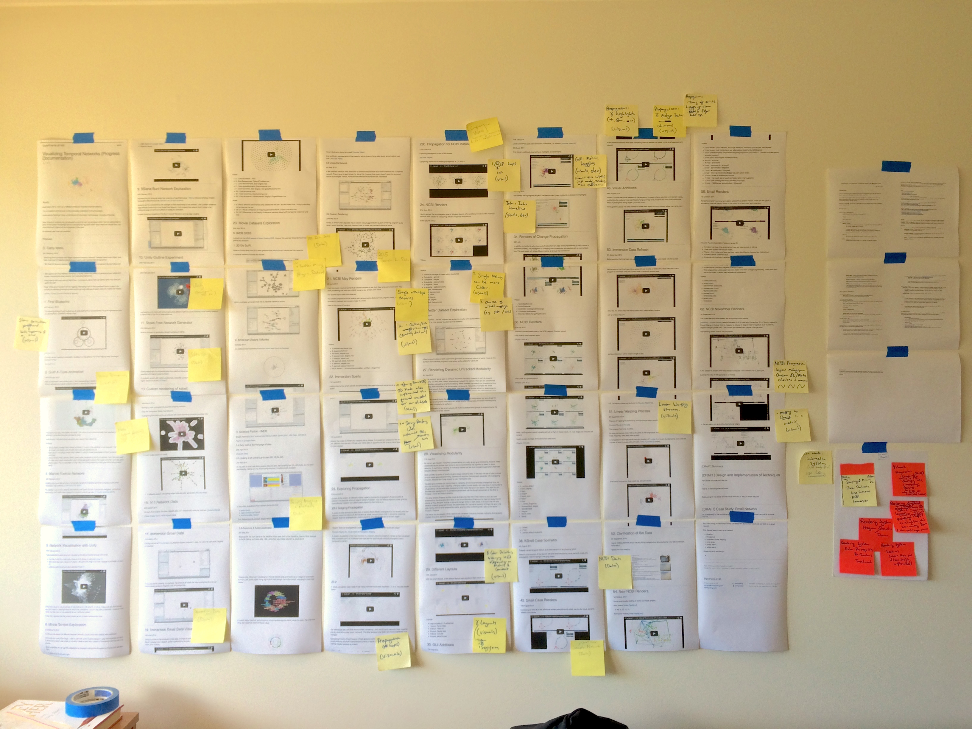
Visualizing Temporal Networks (Technical Process Sketchbook) ( ⚠ LARGE)

About
Beginning in 2014, I took up a research project to visualise temporal networks.
This is a detailed archival post on the processes undertaken during the project.
Supervised by Seokhee Hong, at the School of Information Technologies, University of Sydney.
Note: Videos on youtube can be adjusted to up to 2x their normal speed which may be appropriate for some of the screen recordings here to overcome the lag within them. Most videos are simple links, the more significant videos will be embedded in this post.
All datasets seen here are available.
Process (Technical)
0. Early tests.
3rd February, 2014
Observing how a program like Gephi represents temporal networks. Datasets tested was a basic Java Repo that’s part of Gephi’s collection and Gephi’s own Dynamic Network generator.
With Gephi’s Dynamic Network Generator, it usually follows the pattern of generating new nodes and edges, changing the edge weights, then removing themselves.
It also seems that when saving Gephi files - it is better to export them as GEXFs rather than save the .gephi file itself.
Video “DNA Java Tryoud d” shows toggling dissuading hubs in the forceAtlas2 layout of gephi can provide an interesting breathing effect which can help distinguish graph elements (nodes and edges).
[Videos: 0 Early Tryouts of temporal graphs]
1. First Blueprint
9th February, 2014
The following blueprint was created as an early draft of how network events could be represented with animated effects. Created in Adobe Flash.
A slower version was then requested, resulting in a less elastic, but more ‘step-by-step’ animation. [Youtube Video]
3. Draft K-Core Animation
14th February 2014
Next an animation was created with a ‘halo’ representing a node’s kshell (its maximum kcore value). KCore represents a node’s resilience within a network. For more information on KCore see wiki here.
The darker the halo, the higher the kshell. The colors of the individual nodes here represent their statically computed discrete modularity class.
Data Source: This was done using the java network from earlier (0).
Process:
- Using Gephi, Nodes were filtered at kshell 2, 3, and 4 (the maximum in this network). The higher the kshell, the darker and smaller the node was represented as.
- Each layer, including a base layer (kshell 0, colorful nodes) was played in Gephi and screen recorded.
- Using Adobe After effects; these layers were overlayed on top of one another. Color Key was used to make each layer transparent, and tinting was used to ensure the nodes (and their outlines) were all one color. The combination of color key and Tinting produced a nice glow effect around each layer.
4. Marvel Events Network
18th February 2014
Digging into some Marvel data, a temporal network of characters and their interactions with other characters was created. [0 Network File GEXF]
For a better view of the network, the network was layed out with ‘Fruchterman-Reingold’, colored by modularity, and node-sizes mapped to dynamic degree per year. [2 Visually Modified GEXF]
5. Network Visualisation with Unity
20th February 2014
A few explorations were done into visualising the Marvel Events Network with Unity.
- First the z-axis of a node was mapped to its dynamic centrality [video 5]
- Next node size was mapped to degree centrality and edge thickness mapped to its weight [video 6]
- Lastly smooth transitions were applied [video 7]
Unity didn’t result in the smoothest of interactions for this network. In future, interactive 3d alternatives such as Cinder or openFrameworks should be considered. Houdini was also considered - however that would shut the door on the potential for an interactive system.
It was later decided that the project would opt for a more 2-dimensional route.
8. Movie Scripts Exploration
21st February 2014
Continuing the search for different temporal networks, movie scripts from IMSDB were explored.
The scripts for Lord of the Rings 1, Wall-E, Star Trek, and Futurama Season 1 were downloaded as html. A short java program was written to transform these scripts into a network of characters talking with one another.
When visualised, we can see the progression of character interactions throughout a movie such as Star Trek:
- static layout [2 youtube video]
- dynamic layout:
9. RSiena Bunt Network Exploration
25th February 2014
Still searching for temporal scale free networks of significant sizes - RSiena looked promising. Notably the student networks such as ‘Gerhard van de Bunt students’.
Students can be connected by the strength of their relationship to one another - with a certain threshold edge strength producing a nice Scale Free Network. Unfortunately this network didn’t prove to be sufficiently large (in terms of number of nodes) for animation.
A video showing a snapshot of the Bunt network filtered at varying edge weights:
10. Unity Outline Experiment
27th February 2014
Just playing a bit more with Unity hoping that different methods could produce a nicer looking network. It seems best to opt for an alternative tool.
11. Scale Free Network Generator
27th February 2014
Wrote a program to generate a Scale Free Network (SFN).
Unfortunately with this implementation the maximum kcore value is only 2. We’re presently interested in networks with higher kcore numbers.
A modified version with higher preferential probability constant was also generated that resulted in higher maximum kcore [12 video].
The Barabasi-Albert model was utilised in the program.
13. Custom rendering of kshell.
29th March 2014
Starting to write a program to visualise temporal networks.
Data Set: Generated Scale Free Network.
Highlighting the maximum kcore (KShell) with halos (following the earlier prototype (3)).
Or color nodes based on kshell.
- A different version with fading edges was also later generated. [Youtube Video]
16. 911 Network Data
30th March 2014
As part of the search for more network data - 911 network data was also explored. [Youtube Playlist]
[Pajek: Reuter Terror news network data]
17. Immersion Email Data
31st March 2014
Coming across MIT’s Immersion visualisation of email networks, I used it to mine my own email network to visualise.

It required some cleaning, for example, the removal of nodes that were predominantly one way communications (low in-degree) such as mailing lists.
19. Immersion Email Data Visualisation
19th April 2014
Taking a subset of the immersion email data, a series of renders were made that varied the metrics (kshell, betweenness, degree, global modularity) of a node and the visual attributes it mapped too (color, size, outline).
Playlist Videos:
- A - Color-kcoremax ~.mov
- B - Size-Betweenness, Color-KCoreMax.mov
- C - Color-Betweenness, Size-Degree.mov
- E - Color-globalModularity, Size-kcoremax.mov
- F - Color-kcoremax, Size-degree, Hull-globalModularity.mov
- G0 - Color-kcoremax.mov
- G1 - Color-kcoremax, Size-kcoremax.mov
- G2 - Color-kcoremax, Size-kcoremax, Staging-1Edges2Nodes.mov
Notes:
- B. Tried a different dark themed color palette with this one - actually looks nicer - though potentially not as clear as the rest.
- G0. G1. Visual comparison of mapping just color to kshell, or both color and size.
- G1. G2. Differences in the Staging of elements was also played with (comparing version G1 and G2).
20. Movie Datasets Exploration
25th April 2014
0. IMDB GD05
Looked into the IMDB dataset of Graph Drawing 2005. However this was later discarded as it had been previously analysed.
1. 2010s SciFi.
Science Fiction films from 2010 were gathered from wikipedia and transformed into networks.
A bipartite network of actors and movies.

Which could also be transformed into a unipartite network of actors.

2. American Actors / Movies
2nd May 2014
An additional movie dataset of american actors were found via freebase.

3. Science Fiction - IMDB
Began exploring a list of science fiction films on IMDB “Genre: Sci-Fi, 1500 Titles: 1970-2013”.
3.2 Early look at the first page of data
30th April 2014
3.3 Looking a bit further (up to item 301 of the list).
2nd May 2014
At this point in time I was also trying out import.io as a web scraping tool. It’s a bit clunky, but it is fairly user friendly - taking out any of the coding required in traditional web scrapers.

A few video snapshots of the network during this time:
3.4 Adventure & Action exploration
3rd May 2014
Sticking with the SciFi Genre of the IMDB list. Films were then further filtered for Feature Films, ordered by IMDB Rating, and made after 1990. Adventure was initially selected as a sub-genre.

However, the ‘Adventure’ subcategory in this list proved quite small (only up to 3 pages to potentially pull from, with lower pages being significantly bad ratings), hence the ‘Action’ subcategory was tried instead.
A custom layout was built with concentric circles representing the kshell value of a node. The inner the circle, the higher its maximum kcore value.

Here is that same layout animated [Youtube Video].
And a different representation of the network, with a dynamic force atlas layout, accumulating over time. [Youtube Video]
3.5 Unipartite Network
5th May 2014
A few different methods were attempted to transform this bipartite actor-movie network into a unipartite network. There’s even a gephi plugin for doing this, however, that plugin doesn’t retain the temporal nature of the edges - hence, more manual methods would have to be considered

3.6 Custom Rendering
23rd May 2014
Finally, a version of the bipartite movie network was plugged into the custom rendering program to see what it would look like. Here both size and color of nodes are mapped to its kshell value.
20.5 Summarising The Search for Temporal Expansive Scale-Free Network Data
14th May 2014
The past few months have involved a search for scale-free, temporal, network data that were sufficiently large.
The search has involved data from conferences, academia, machine learning, Marvel, Twitter, NSW Statistics, and various Movie databases.
The full documentation can be found here. [PDF]
The conclusion from the search was: In searching for network data that was expansive, temporal, and potentially scale-free. Of the datasets explored, Movie data appeared to fit the criteria best, with IMDB lists being the most flexible.
21. NCBI May Renders
9th June 2014
I had previously received some NCBI network datasets in late April. New ones were received in May. After processing this data into a GEXF format, a few renders were made.
The applied layout was force-directed.
The renders explore the NCBI network with various metrics (betweenness, degree, kshell, static modularity) mapped too the color or size of a node.
Here is the playlist of renders:
Videos
- A betweenness,kshell.mov
- B degree,kshell.mov
- B2 kshell, degree.mov
- C betweenness, degree.mov
- D statmod, kshell.mov
- D2 statmod, kshell, hulls.mov
- E statmod, degree.mov
- F statmod, betweenness.mov
- NCBI render 1 - colorAndSize-kcoreMax - withText - staged.mov
22. Immersion Spells
11th June 2014
Looking back at the email network and processing it so graph elements are temporal i.e. giving them ‘spells’.
17th June 2014
Colored the nodes by KShell and mapped size to degree. Compared two variations of the animation with different time intervals (10% left, and 100% right). It appears the 10% one on the left appears as if it’s more detailed.
23. Exploring Propagation
21st June 2014
As part of this project, an attempt is being made to visualise the propogation of metrics within a network. For example, when an edge is added or deleted - how that effects adjacent nodes, and how those effected nodes in turn effect nodes adjacent to them and so on.
23.0 Staging Propagation
A series of initial animations were done to explore these different propagation (or hop levels) within the network under the metrics of, and visualising, kshell, betweenness or both. It should be noted that ‘degree’ does not propagate as a node’s degree is only directly effected by its own edges.
Process Playlist of a visual check of Propogation Staging
A clearer visualisation of the hops involved in a network. (Here the maximum number of hops visualised was increased from 3 to 5. Betweenness was also the more visually obvious propogating metric compared to kshell.)
23.2
A visual comparison was made of how many maximum hops were visualised 1, 2, or 4. Youtube playlist below.
The differences are a bit more obvious when comparing 1 (left) and 2 (right) maximum hops - towards the very end of the video ‘prop1 vs prop2’. The latter appears to be faster and more incremental in its changes.
Comparing Prop4 to Prop2 however; Prop2 appears to show more as few propogations reach the prop4 level and since all increments are currently of equal duration, prop4 has larger periods where nothing visually happens as a result.
23b. Propagation for NCBI dataset
21st June 2014
Exploring propagation on the NCBI dataset.
Comparing maximum visualised propagations at 1, 4, and 8.
24. NCBI Renders
21st June 2014
Having agreed that a propagation level of 4 looked decent, a few additional renders of the NCBI bio network were created of it exploring different mappings and metrics.
Video playlist below:
Videos:
- combo (a montage of videos within the playlist)
- 0 singleVar - general
- 1 singleVar - degree
- 2 singleVar - betweenness
- 3 singleVar - kshell
- 4 singleVar - staticModularity
- 5 degree, betweenness
- 6 mod, betweenness
- 7 mod, kshell
- 8 mod, degree
- 9 kshell, degree
- 10 kshell, betweenness
25. Twitter Dataset Exploration
4th July 2014
As a brief detour - a quick program was written to mine for some basic twitter data such as the most recent 100, or most popular tweets that involved #tech .

A few hundred nodes certainly wasn’t enough to form a connected network of words. However, the skeleton of the network program is now written and available for future use.
27. Rendering Dynamic Untracked Modularity
6th July 2014
Gephi is currently being used to compute the metric modularity. However, it can’t do dynamic modularity - for that, often custom applications or algorithms are built. There are two predominant methods when calculating dynamic modularity: either consider the network one timestep at a time, computing static modularity that accumulates into dynamic modularity, or consider the whole longitudinal network during the computation. The latter method is more refined but takes longer to accomplish. Since dynamic modularity isn’t a high priority in this project, the easier method (using slices of static modularity) is preffered.
Here is an animation of the email network with ‘hulls’ (outlines around groups of nodes) showing the changing modularity of the network.
28. Visualising Modularity
11th July 2014
So we can get the static modularity (classifications of a node) at any given timestamp, however, these classifications can change over time and are not tracked since the algorithm is meant for static networks. A preliminary ‘tracking’ of modularity classes can be done by applying jarcadian distances between different modularity sets.
Next came the question of how to visualise these modularity sets. In the past, the use of hulls / outlines around nodes appeared promising, however this could be misinterpreted especially with overlapping modules. Modules don’t map linearly to size. That leaves color.
Visualising the modules (or communities) is interesting since the communities change over time. As such, so should their color mapping - changing slightly to small events, and vice versa. A community is influenced by the characteristics (modularity) of the nodes that join it and leave it. This need for non-discrete color representation is perhaps explained best with the thought experiment of ‘the Ship of Theseus’, known as Thesus’ paradox.
“The ship wherein Theseus and the youth of Athens returned from Crete had thirty oars, and was preserved by the Athenians down even to the time of Demetrius Phalereus, for they took away the old planks as they decayed, putting in new and stronger timber in their place, in so much that this ship became a standing example among the philosophers, for the logical question of things that grow; one side holding that the ship remained the same, and the other contending that it was not the same.” — Plutarch, Theseus
The below is a visualisation of the network with untracked modularity, tracked modularity (first iteration), tracked modularity (second iteration i.e. a couple bug fixes).
29. Different Layouts
14th July 2014
With the email network, a few different layouts were explored. Seen below in the video playlist.
Layouts
- 0 layout [default] - Fruchterman
- 1 layout - Force Atlas
- 2 layout - Yifan Hu
- 3 layout - Radial Axis
- 4 layout - Circular
- 5 layout - MultiCircular
30. GUI Additions
17th July 2014
Used ControlP5 to add some essential UI elements, i.e. timeline. [Youtube Video 30]
22nd July 2014
And also an additional visual attribute; highlights and backlights:
24th July 2014
Also looked into highlighting edges if they were added (green highlight) or deleted (red highlight).

34. Renders of Change Propagation
28th July
In addition to highlighting the hop level of nodes from an edge event (represented by their number of concentric circles), the propagation of changing metrics were also represented with a moving black line. This was tested with a few different metrics and visual representations:
Videos:
- A colorSizeBetween
- B colorSizeKshell
- C colorMod sizeDegree(NilChange)
- D colorMod sizeBetween
- Ω Combo ABCD changePropRenders
36. NCBI Renders
31st July 2014
A series of renders were made of the NCBI network. (Playlists below)
First under a force-directed layout:
Then under a Sugiyama layout:
Note - the Sugiyama Layout is positioned Left to Right in these videos, i.e. most edges are directed left to right.
Here’s a video montage of the above two collections:
Videos:
- 0 _combo_default
- 0 btwn, degree
- 0 btwn
- 0 degree
- 0 kshell, btwn
- 0 kshell
- 0 mod
- 1 _Combo_Sugiyama
- 1 betweenness, degree
- 1 betweenness
- 1 degree
- 1 kshell, btwn
- 1 kshell
- 1 mod
- _combo_default+sugiyama
38. KShell Case Scenario
4th August 2014
Created a small temporal network as a case scenario for emphasising kshell.
Below is a comparison of the network with and without additional visual elements (rings and propagation lines) to highlight changing nodes.
42. Small Case Renders
14th August 2014
Continuing on from 38, a few additional renders were done with kshell, varying the visual elements utilised in the render.
A few additional renders were done comparing metrics besides just kshell in this small case scenario network.
46. Visual Additions
28th August 2014
Added a couple new visual elements to the animation: crosses to focus attention on important nodes, highlighting the nodes of most significant change per hop level, tweaked the look of the transitional effect of propogation along edges. [Youtube Video]
The Sugiyama Layout was also rotated so nodes were layed out top to bottom rather than left to right.
50. Immersion Data Refresh
9th September 2014
Before warping the Email data into a series of linear events, a rende were made with the current program to remember what the current state of the email network was.
After this, the Email data was manipulated into a linear series of events;
with a window step of 1
and as processed - with a window length of 200.
P.S. The above videos can be found in [Youtube Playlist 50].
51. Linear Warping Process
8th September 2014
Process of mapping the timeline so individual edge events would be linear:
The program had to be rewritten.
An early comparison was made of a subset of the longitudinal email network [without (0)] and [with (1)] linear mapping. Less gaps were evident.
A comparison of all edge events having a duration of 1 [video 3], or event durations that scale with the number of hops involved within an event [video 4], [video 5] (below).
Eventually the previous draw code was reimplemented.
52. Clarification of Bio Data
9th September 2014
Had a meeting with Falk about the Bio (NCBI) dataset which provided some very help contextual information.
Notes from that meeting:
 (Bio).jpg "bio meeting notes")
54. New NCBI Renders.
1st October 2014
Some visual tweaks leading to some new NCBI renders.
Main Videos [Video Playlist 54]:
- 4b, 9, 10, 12, 13
All Process Videos [Video Playlist 54*]:
Videos:
- 0 ncbi render - (with direction, and edge deletions, additions) (prop edges, raw degree)
- 1 ncbi render - (still highlighting new edge states) (coloring by deltaDegree)
- 2 ncbi (differentPalette) (edgeStateChangeHighlights=off) [INCORRECT - visuals attributes werent encoded properly]
- 3 ncbi (fixed deltaDegree nodeMetricValue)
- 4a ncbi - endopen
- 4b ncbi - endclosed
- 5 ncbi - (same as 4b - all good)
- 6 ncbi - activeNodes>0degree∂
- 7 ncbi - activeNodes>1.5degree∂
- 9 ncbi - showing transitionBallEdges between active nodes
- 10 ncbi - slower & sizeMappedToNone
- 11 ncbi - hop levels set to hopsFromNodes rather than sugiyama
- 12 ncbi (now drawing self-loops) (showing hop-rings)
- 13 ncbi - (1800frames, activeNodes>1.5degree∂)_
56. Email Renders
4th October 2014
Rendered a set of new email animations across the available metrics. There are two types of animations; one that maps a metric to just color, or to both color and node size.
[Youtube Playlist] Description: Notes on series 56:
- Animation has been time-stretched so there are less periods of silence.
- Cross hairs appear over source nodes.
- Filtered – Only nodes who have had their metric significantly changed are ‘highlighted’.
- Numbers denote a metrics value.
- Arrows denote positive or negative change of metric.
- Thick edges show a connection between nodes who have changed significantly. These start from the source node, in series, they represent a propagation.
Videos:
- whole (color,size)
- whole (color)
- betweenness (color,size)
- betweenness (color)
- degree (color,size)
- degree (color)
- kshell (color,size)
- kshell (color)
- mod (color)
62. NCBI November Renders
1st November 2014
Just a few fixes and visual tweaks like an updated color palette.
[Series 62 - Youtube Playlist]: Network renders of NCBI data as of November 2014. Size is mapped to Overall Degree of Nodes. Color is mapped to change in degree (red is negative, blue is postive). Degree changes greater than 1 are circled and labeled with degree change value.
The following render version was requested:
A few additional renders were also made to compare a few different visual attributes,
such as the order of the appearance of nodes
or the animation with and without transitional edges.
Summarising
This post was consolidated with a few notes to write a summary.
Additional observations about the email network were made and ordered for the summary. These observations can be read in the link below.
Summary writeup of the design and implementation of techniques, and the case study of the email network can be found on this site under: ‘Visualising Temporal Networks (Summary)’.