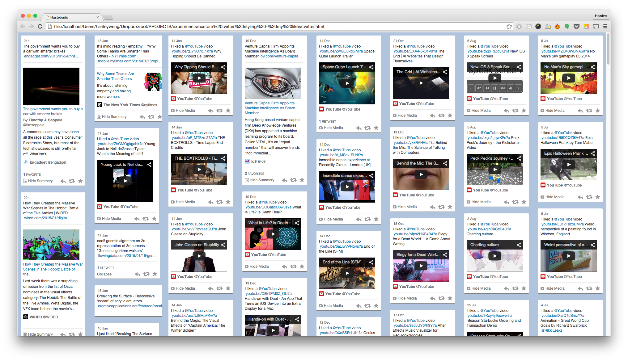
Twitter Moodboard of Likes (Quick Web Experiment)
Continuing my desire to visualise moodboards of inspiration; I’ve using twitter to automatically (e.g. Vimeo, Youtube) and manually tweet discoveries on the interwebs I like.
Did a quick hack of the twitter iFrame so it’ll have a more moodboard look to it (akin to Google+, Pinterest, Tumblr Archives) - rather than the linear timelines that twitter is commonly represented as.

Process:
Different methods were investigated for this effect; notably the use of Twitter’s official or third-party APIs or services like TweetDeck. However none really served to offer the tweets in their full quantity or form (with expanded website previews as well). Hacking and styling an iFrame seemed the best way to go, and it was an interesting undertaking. A few weird timeouts and CSS that changed as the page loaded had to be utilised.
Post-Reflection:
The original code is archived. Update: Note this is for curious devs only, as with most hacks, especially ones with web and iframes, the code itself no longer functions as twitter has since changed the css of their twitter widget multiple times.
Here we’re using css columns to organise the moodboard; prioritising quick visual aesthetics of the board above functional legibility of reading in rows. For more functional use - where chronology is important, would have to use row-based-placement instead (e.g. fixed heights, flexbox - or time permitting; js and backend to measure heights and position elements accordingly).
All in all, the ideal approach would be building this from the ground up, with hooks to the tweets via official apis, and a backend server / external service to generate website previews. Alternatively could also find a different bookmarking service for digital media.