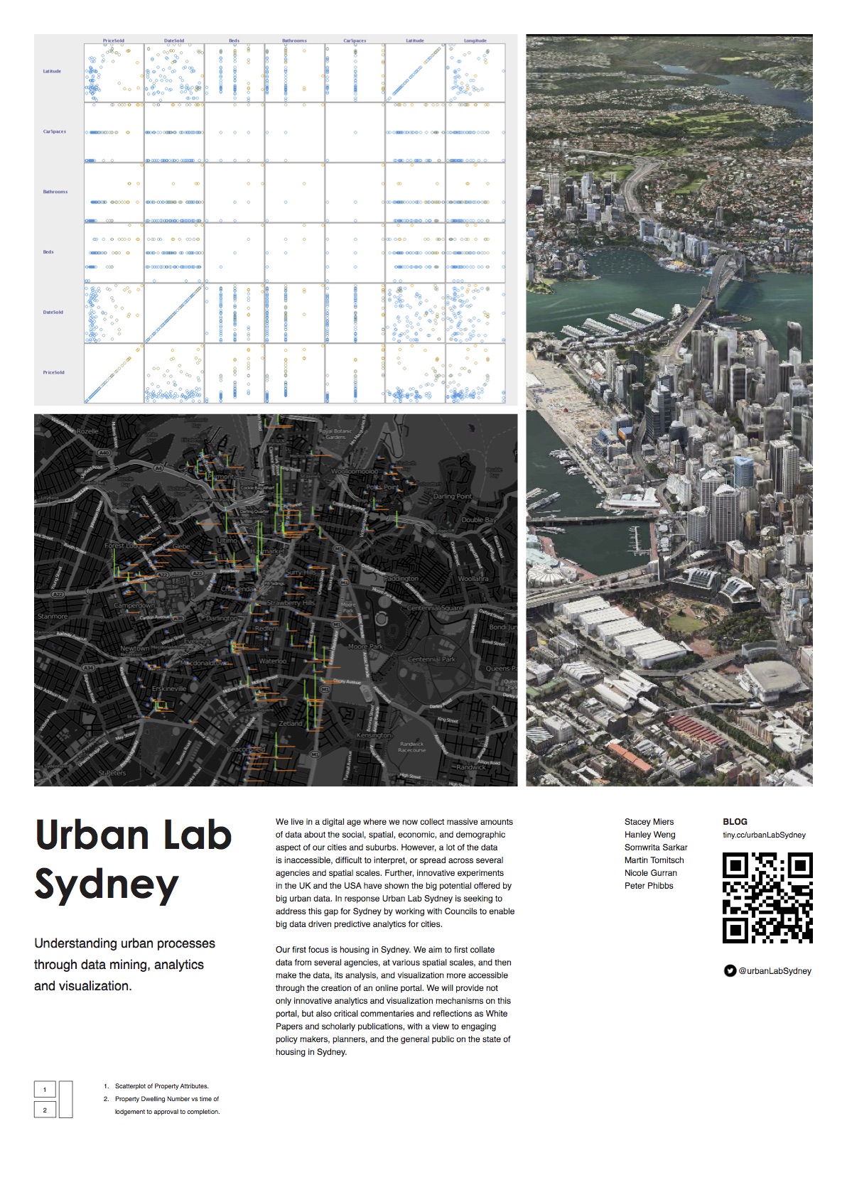
Urban Lab Sydney (snapshots)
About
We live in a digital age where we now collect massive amounts of data about the social, spatial, economic, and demographic aspect of our cities and suburbs. However, a lot of the data is inaccessible, dif cult to interpret, or spread across several agencies and spatial scales. Further, innovative experiments in the UK and the USA have shown the big potential offered by big urban data. In response Urban Lab Sydney is seeking to address this gap for Sydney by working with Councils to enable big data driven predictive analytics for cities.
Urban Housing Lab at Sydney promotes research that connects urban governance, planning, infrastructure, the housing market and big-data analytics, while distilling key implications for policy and practice.
My time in the lab involved consulting with experts in data and urban planning; Nichole Gurran, Somwrita Sarkar, Catherine Gilbert.
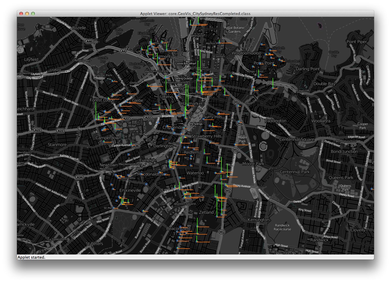
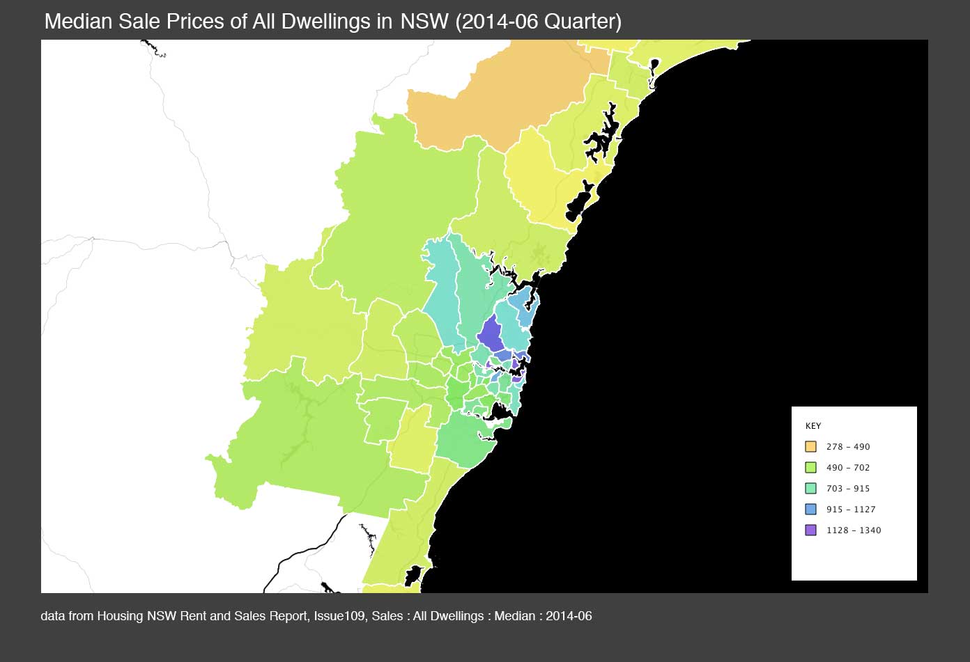
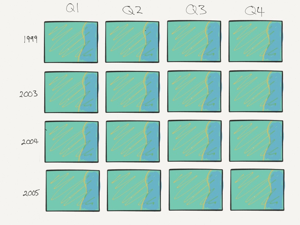
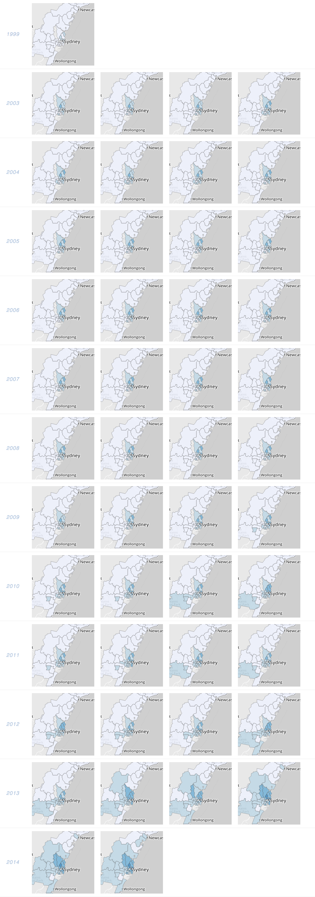
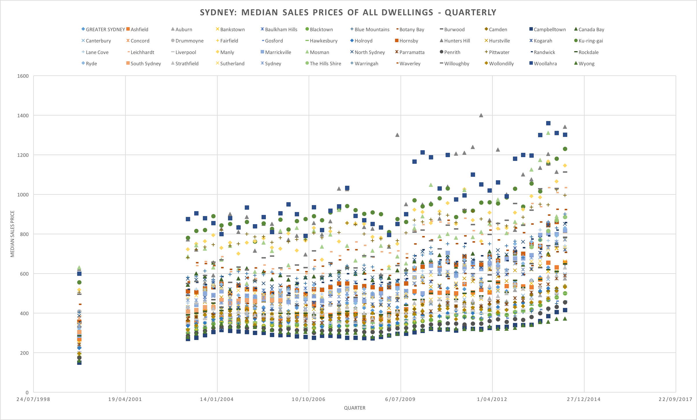
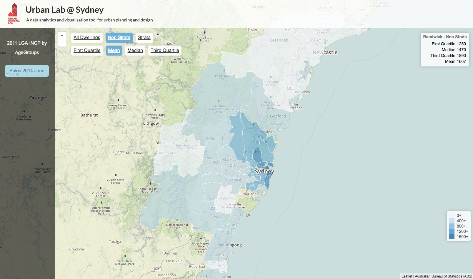
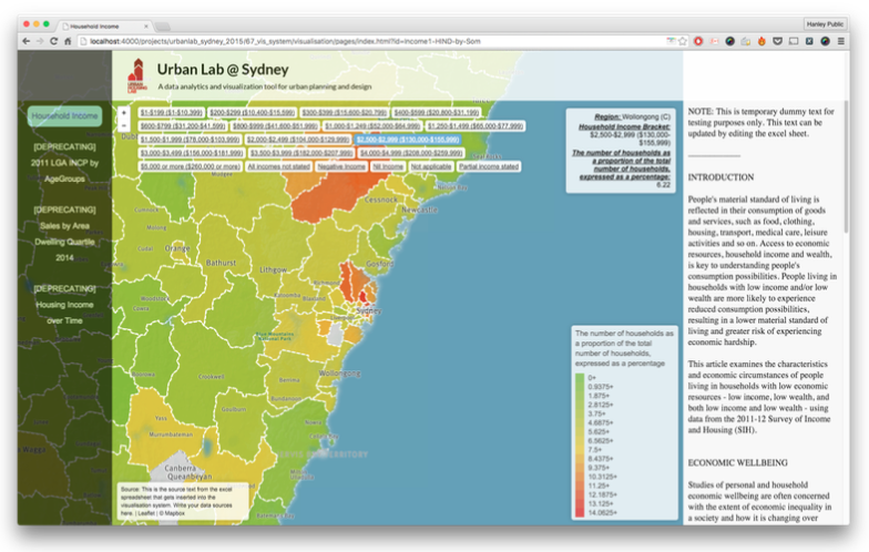
There was some general branding, social media setups, visual and interactive assets. Data was researched, mined (with manual and custom automated methods), aggregated, cleaned, analysed (sometimes with the aid of machine learning and pattern recognition), and visualised for insights and internal conveyance of findings. Such visualisations included chart-based, geo-spatial, and temporal visualisations.
These evolving visualisations took the form of posters, iOS Apps, reports, and custom Web-Based CMS Applications such as a private Multilayered Geospatial Choropleth Visualisation System akin to Tableau / CartoDB / ArcGIS - but with more bespoke features.
Some of the most prominent tools included: Web technologies, d3 js, tableau, leaflet js, Processing, Swift, Objective-C, Unfolding Maps, Excel, and Weka.
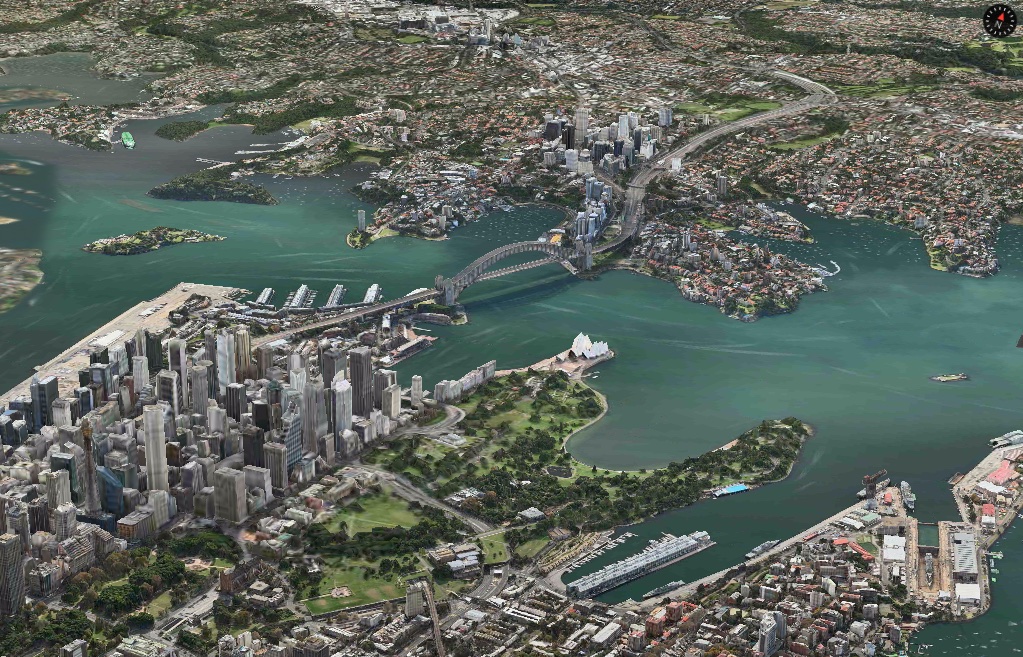
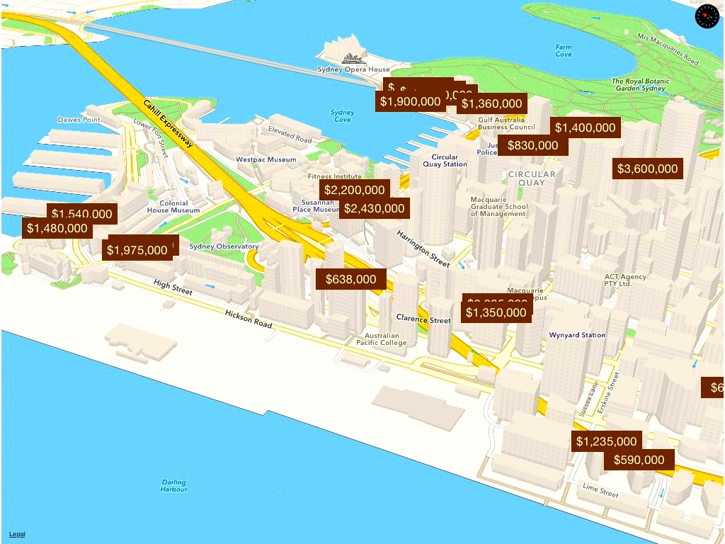
Some WIP Snapshots
Unfortunately there’s are quite a few insights and graphics that aren’t public. Instead I’ll share here some of the wip snapshots during the project.
Key Learnings
- universal accessibility is important
- desired briefs need to be actively re-evaluated
Also, as the project evolved, the custom-made presentation-focused visualisations and apps weren’t as useful due to: progressions in existing commercial technology, a lightening of desired bespoke features, and the eventual lifting of certain constraints. This has allowed the switch to more commercial and well-tested tools like CartoDB and Tableau, trading control for more immediate results and efficiency.
Regardless, the data mined, analysed, and insights gained thus far have proven themselves intriguing and useful.