Paintings of the Year Reimagined (Installation) - Utopia Festival, UOB
About
Art transcends language, culture and time and the best works inspire the imagination.
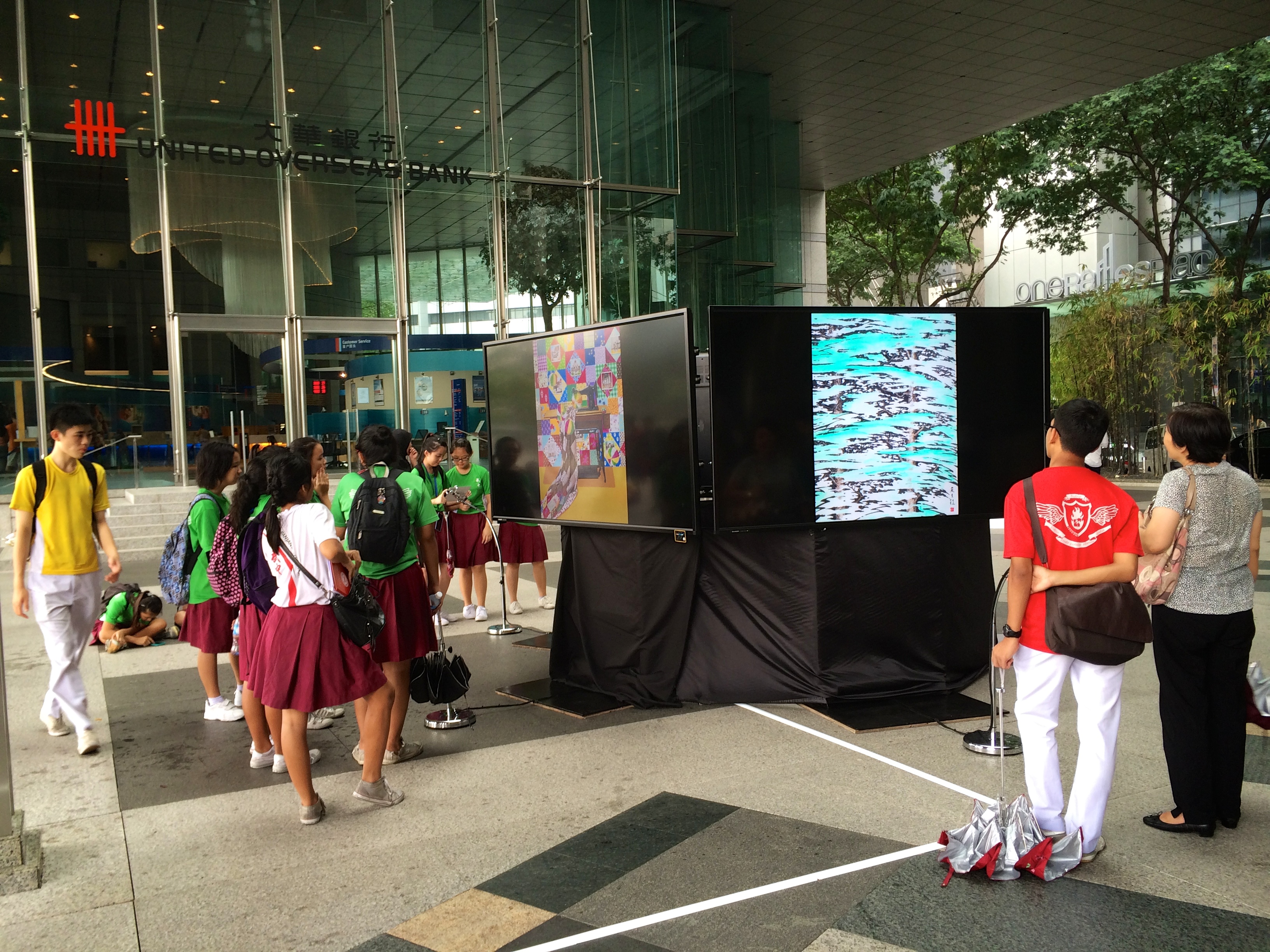
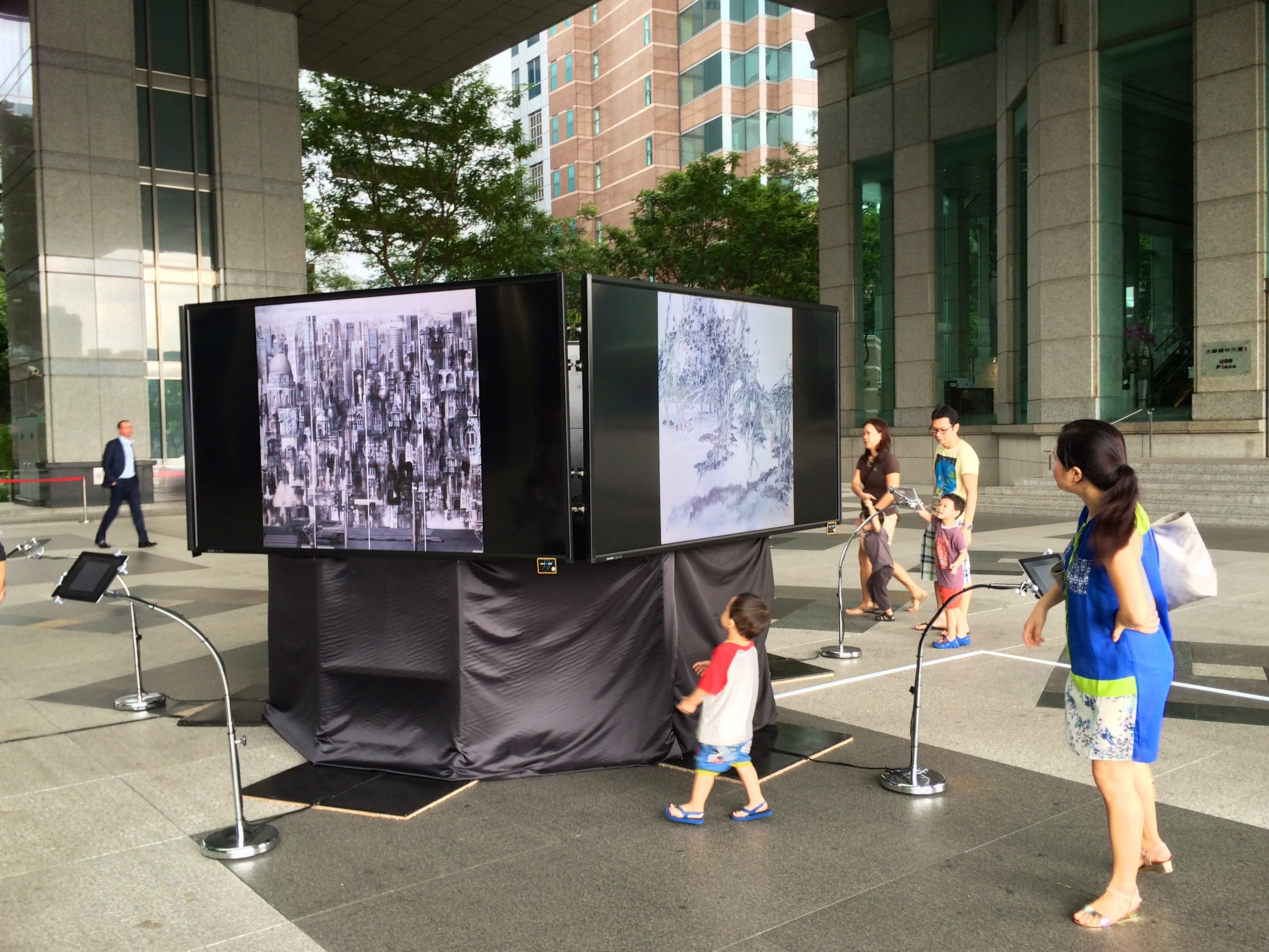
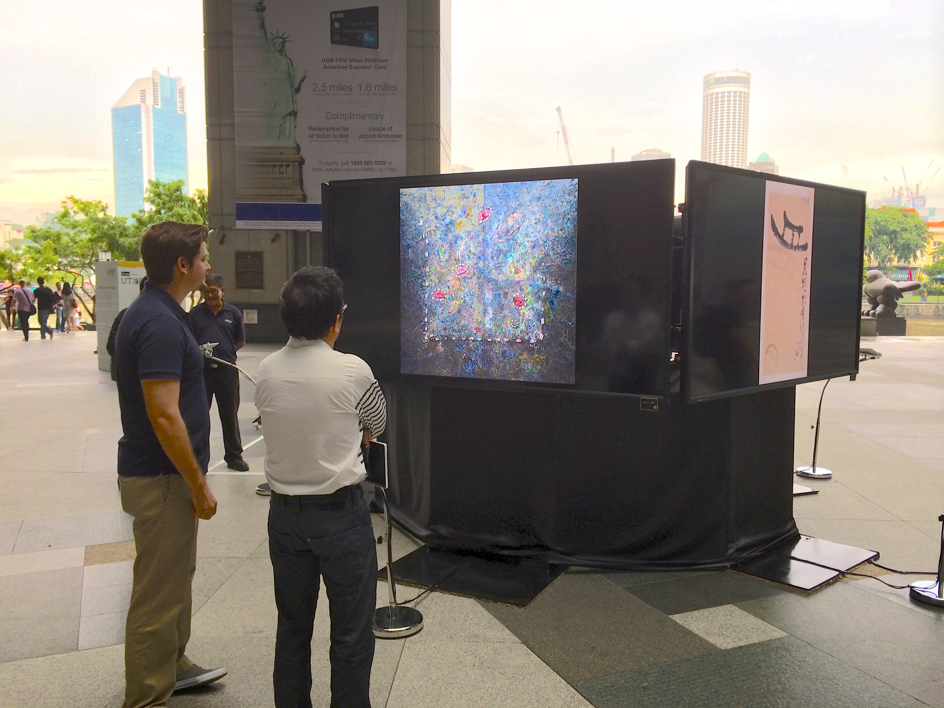
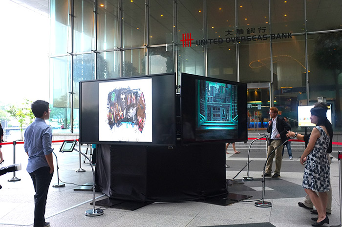
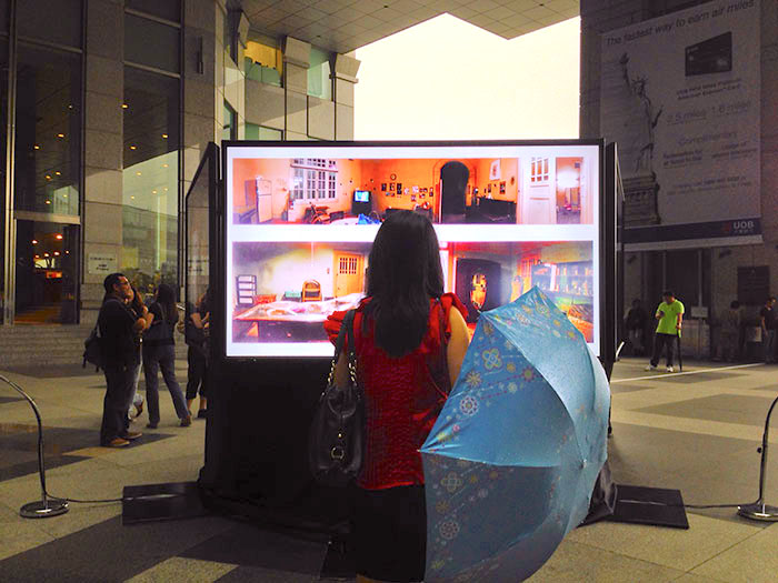
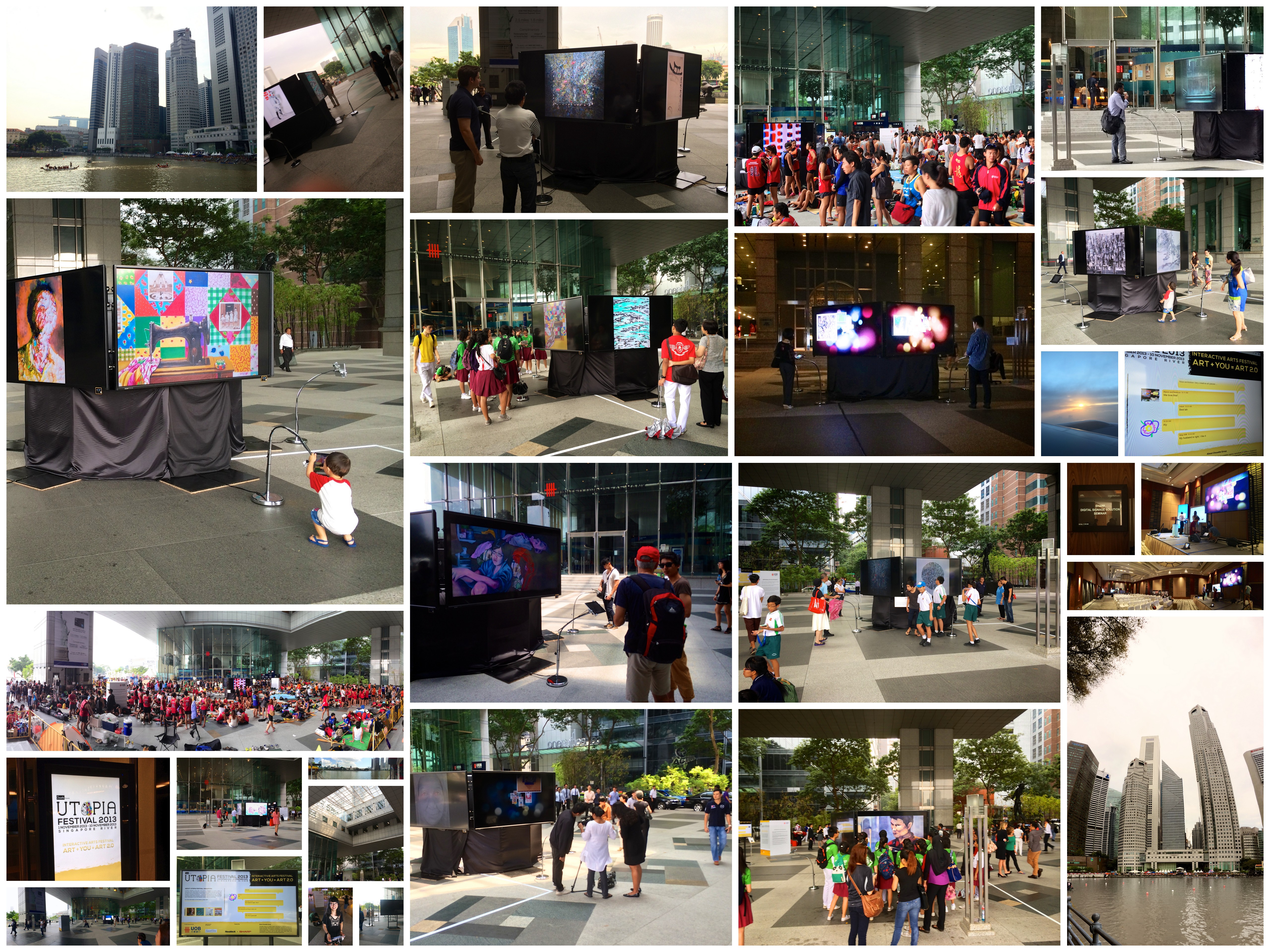
The UOB Painting of the Year Reimagined exhibition is an interactive art display where technology and art merge to encourage the audience to experience and to appreciate paintings in ways never seen before. In this exhibition, 14 award-winning paintings from the UOB Painting of the Year collection have been digitally deconstructed and re-imagined to draw attention to the finer details of the artworks.
The work immersed people in a constellation of paintings, where they delved deeper into their meanings and discovered subtle and delightful animations within.
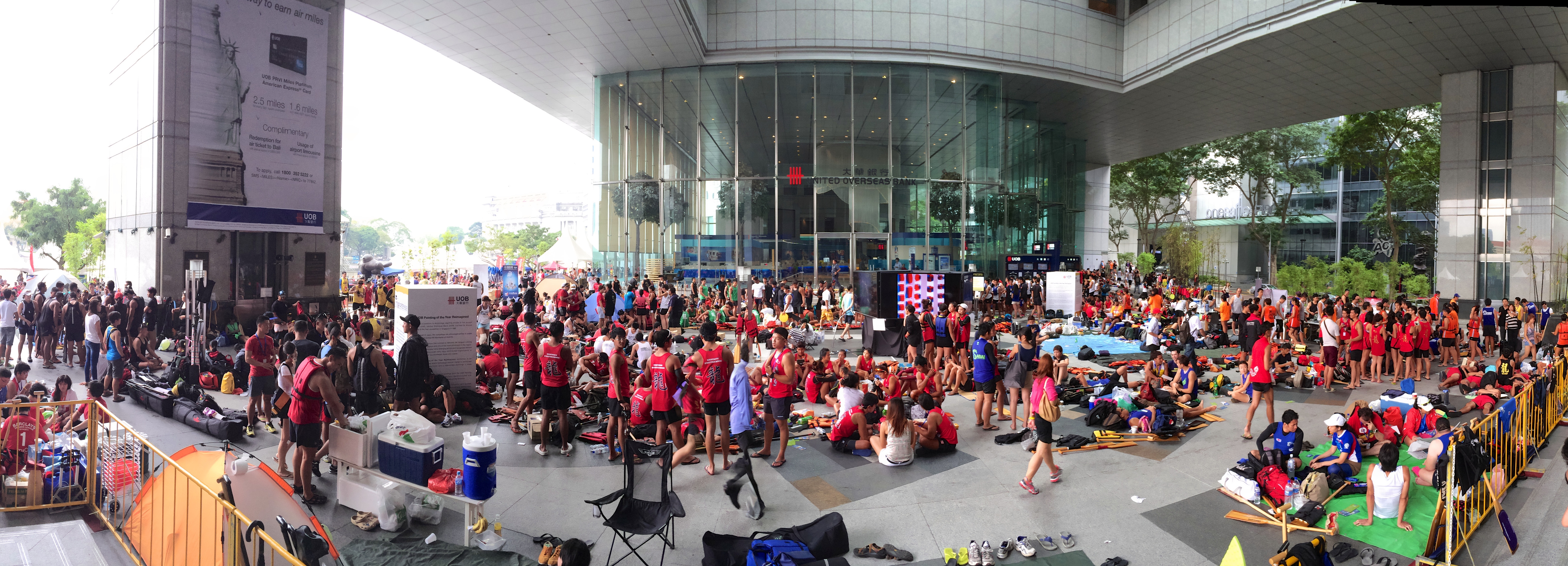
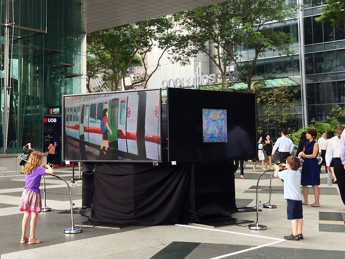
We estimate over 10,000 people interacted with the installation over the 10 days - not including the thousands that passed by or observed from afar in the busy thoroughfare of the UOB atrium in which the work was situated.
Setup
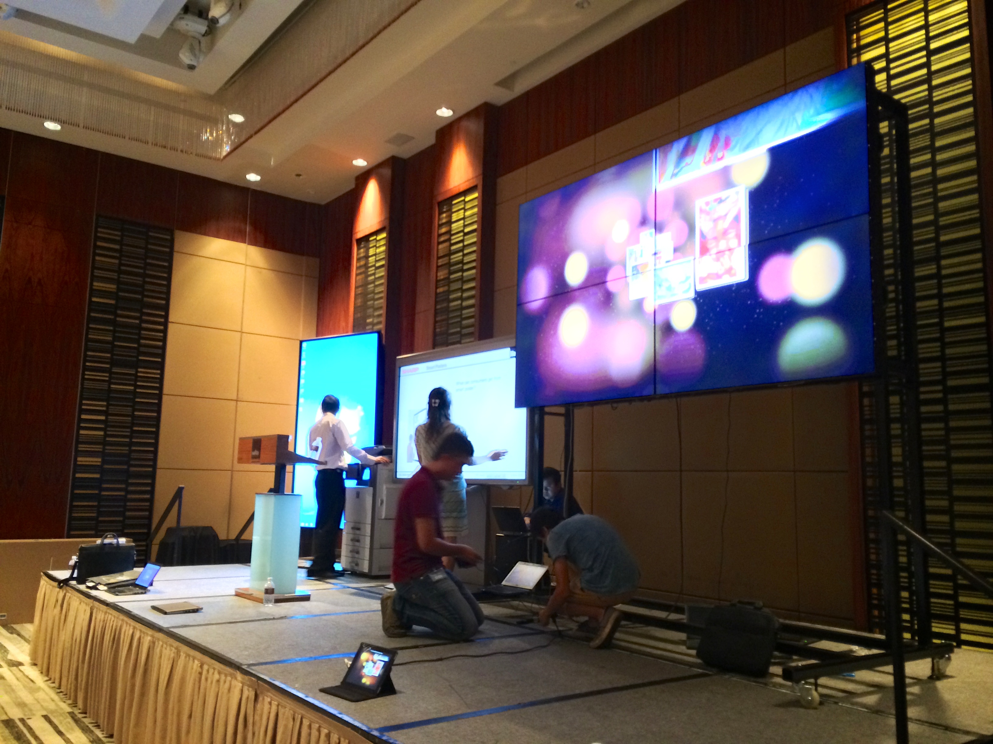
The installation consisted of five iPads that drove the visuals for five 90 inch, running for 10 days in the busy thoroughfare of the UOB atrium.
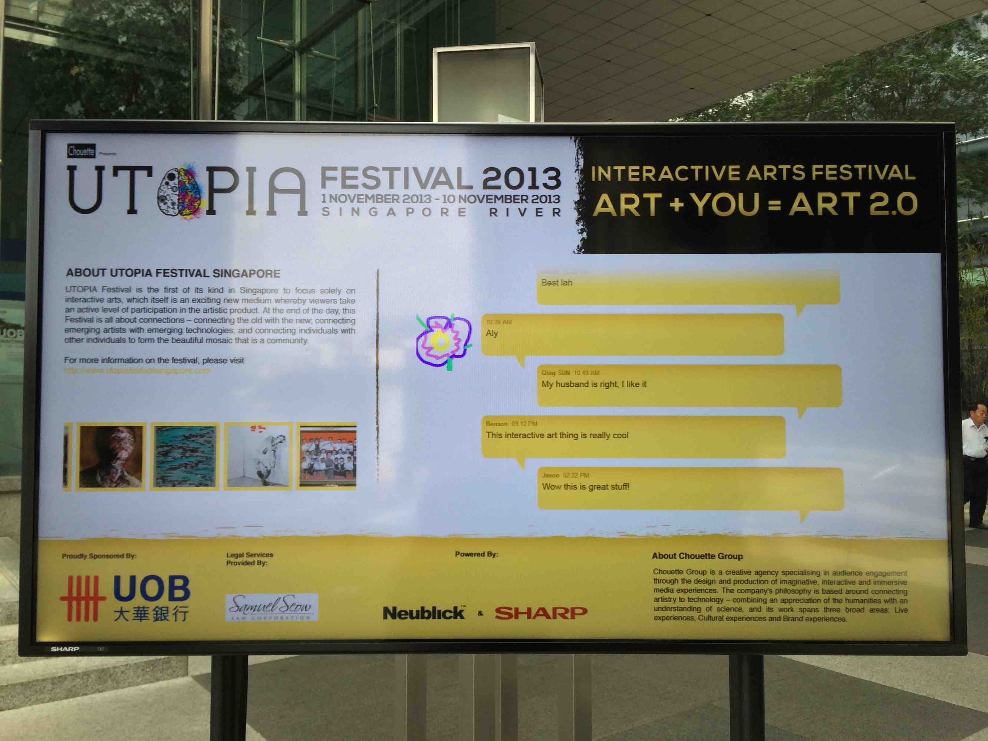
The work was commissioned for the Utopia Festival Singapore 2013 by the United Overseas Bank . The large screens were generously provided by SHARP electronics.
Team
Mark C Mitchell, Emila Yang, Hanley Weng
Many thanks also to Jess Hii – an outstanding director for the Utopia Festival.
Process
With a brief simply that we had a lot of Paintings to work with for the Utopia Festival, the project was begun with a few initial concepts to spark discussions.
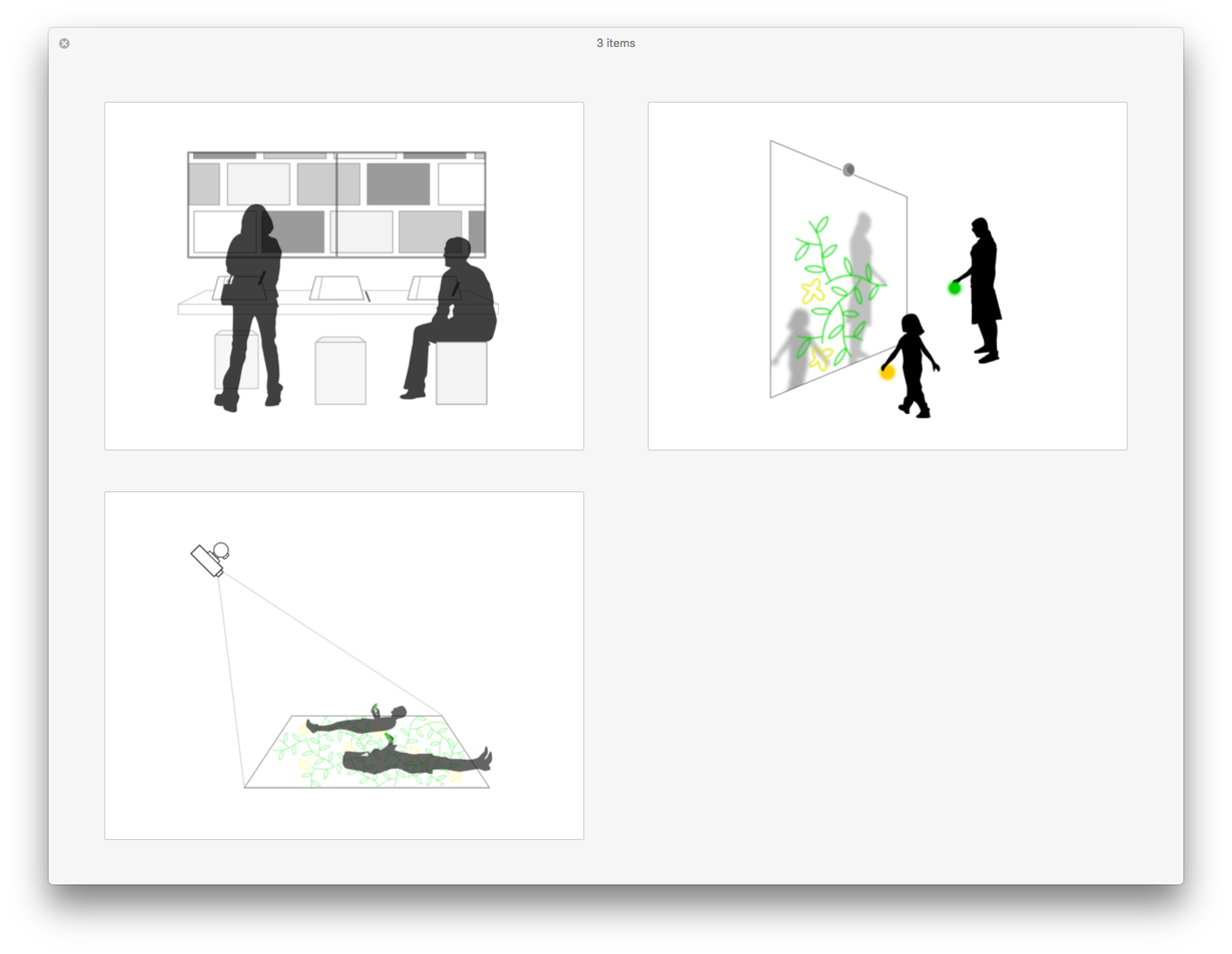
Planning an installation in Singapore, from Sydney, a good understanding of the space was required. Hence, mockups of the space and the potential work were done.
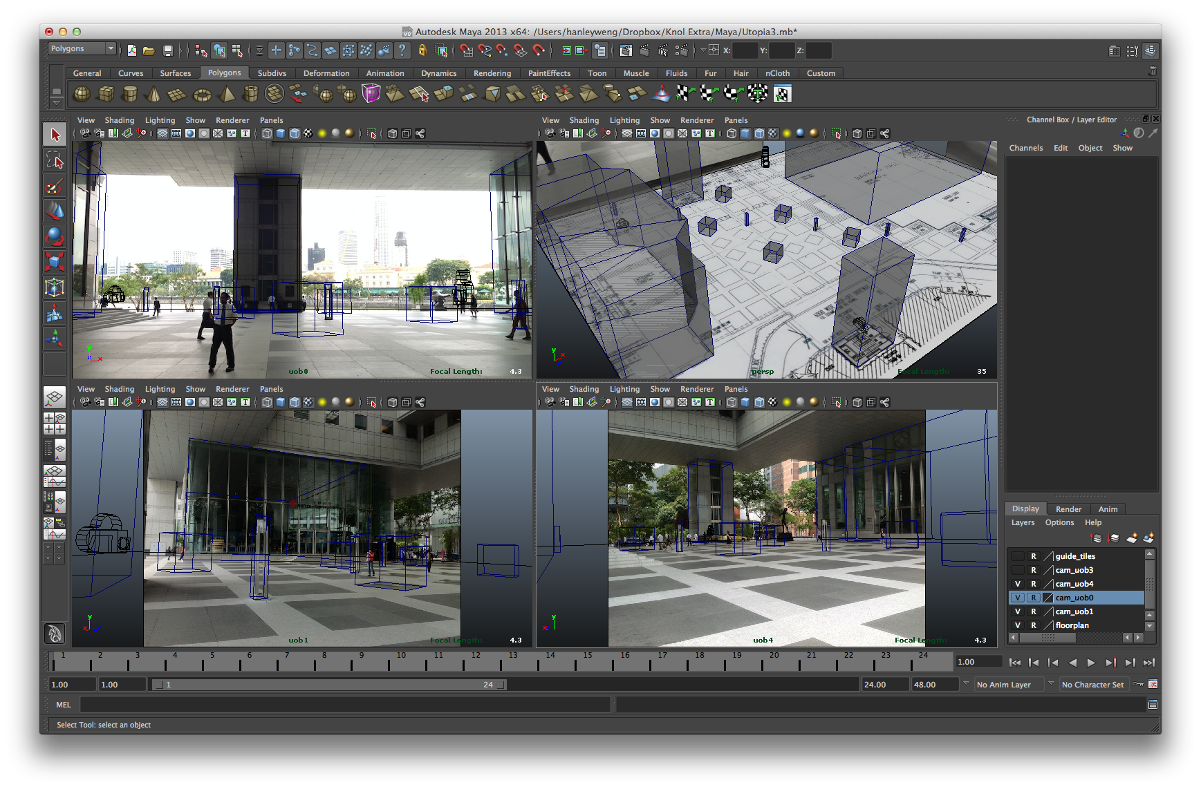
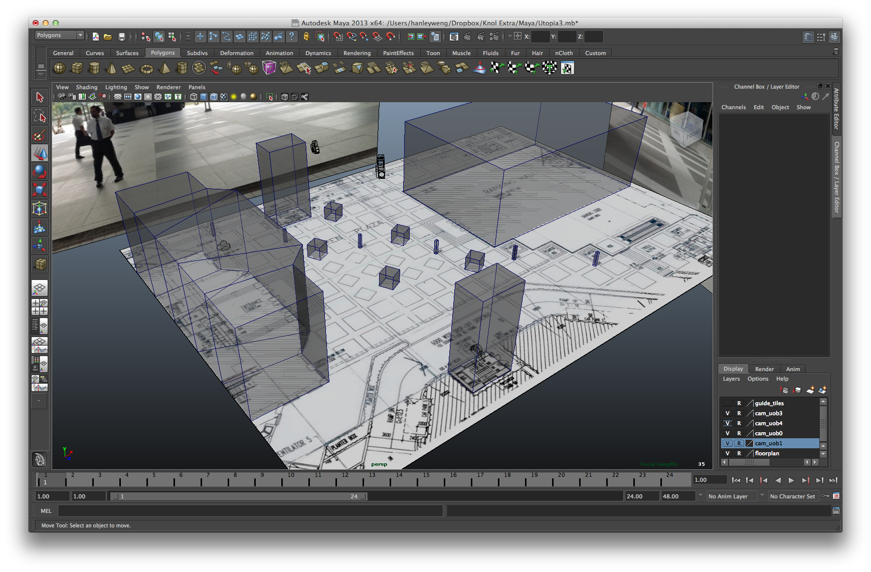
Which refined the high-fidelity concepts for the work.
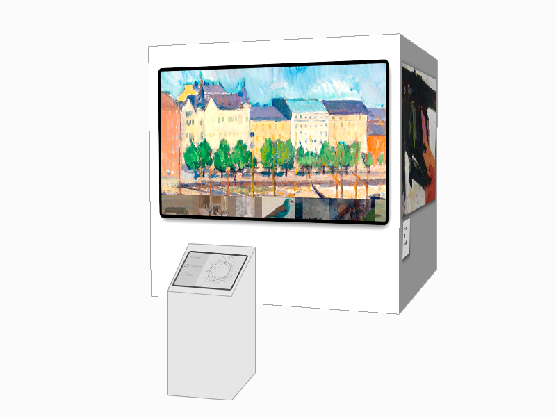
Lots of batch image manipulation and metadata processing was done, with the aid of Aperture, Photoshop, and Excel.
At this point we had decided on using iPads to drive the display of images and videos on a larger screen.
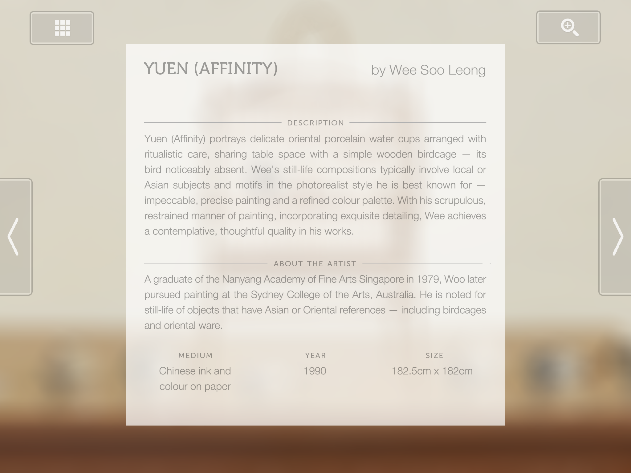
With the data beginning to be processed, higher fidelity mockups of the dual-screen interface could be formed in conjunction with evolving design specifications for communicating with the clients. These designs had to exist such that they considered all varieties of paintings, at various sizes and colours.
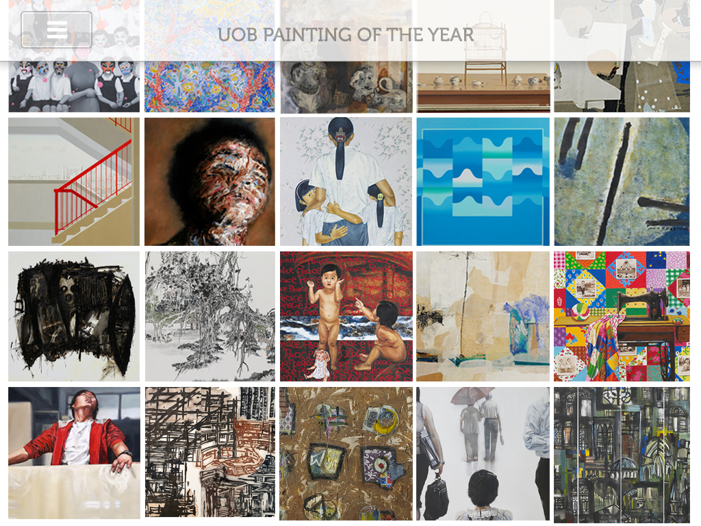
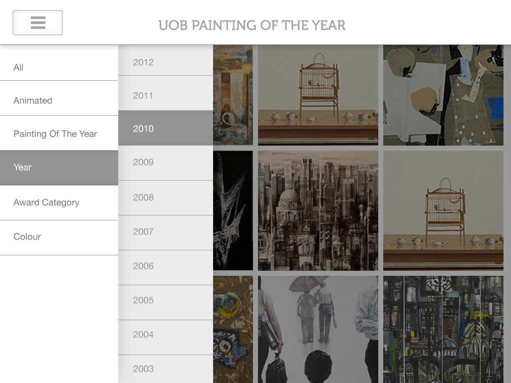
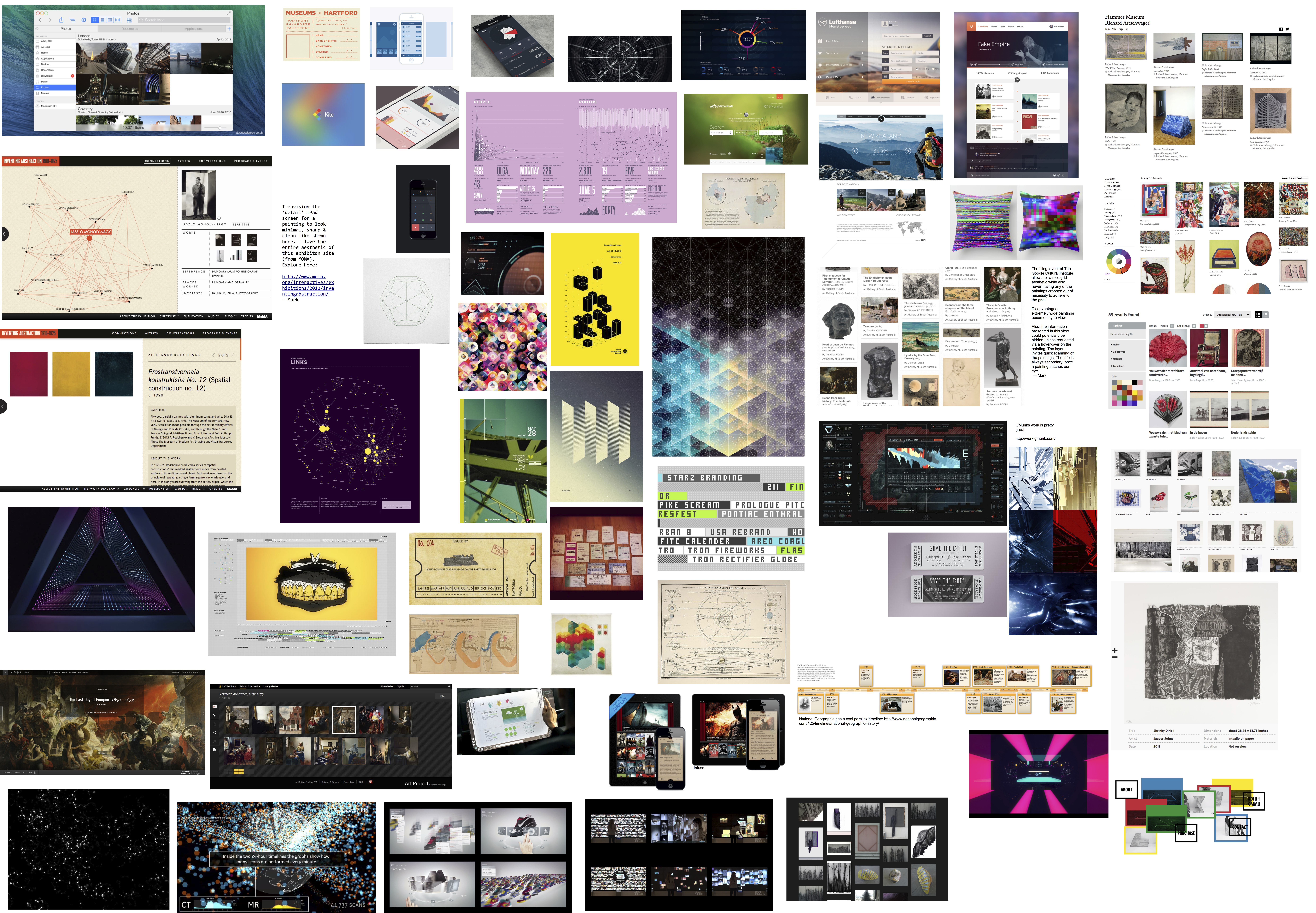
We weren’t really happy with the stock-standard UI-Grid though so we went back to moodboarding.
We decided to switch from using UITableView and Storyboard in XCode to a SpriteKit view - which allowed us to have more interesting, visually aesthetic bokeh effects as we altered the interface from a grid of thumbnails to a constellation of zooming images. The zooming was controlled by ones movement of the iPads, and each image could be tapped on for more information and a closer, potentially animated, view of the artwork.
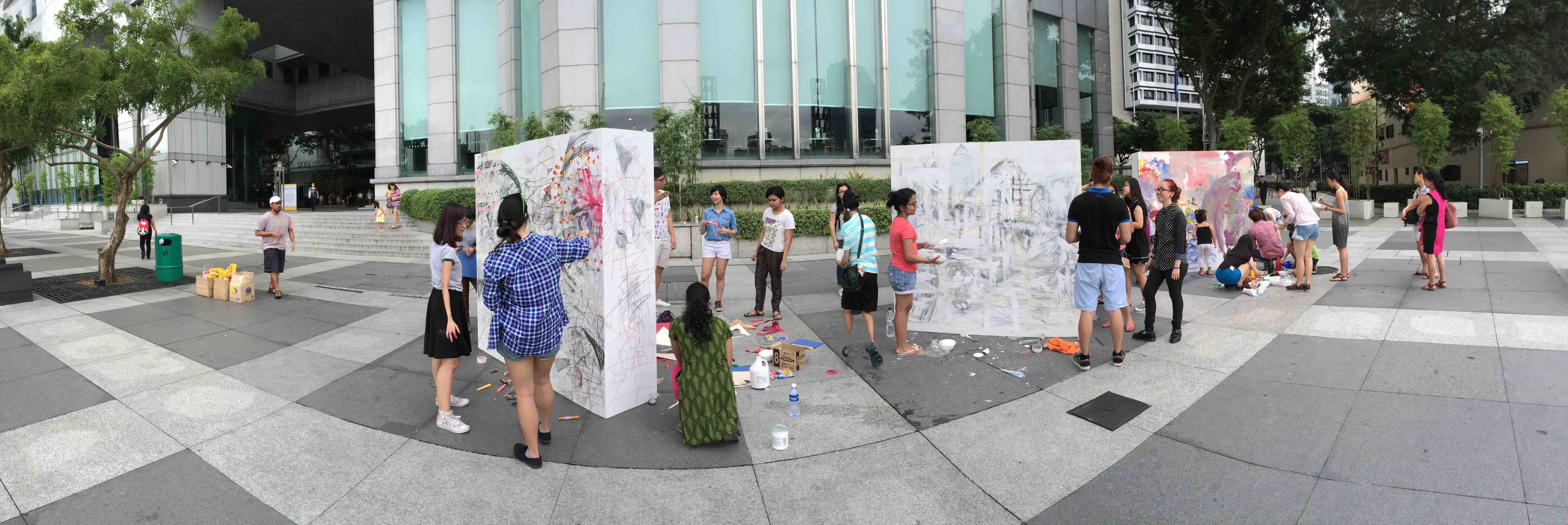
Some of the other surrounding works / events:
Here is an overview of the process:
Media
Some select photos - kids did the cutest things around the install
